Commercial new construction of the Jacksonville State University Fitness Center in Jacksonville Alabama, photographed for Turner Construction and Moody Nolan Architecture by Birmingham Alabama based architectural and interiors photographer, Tommy Daspit.
Read Morecommercial
Gabby Home Veranda Magazine AD Shoot /
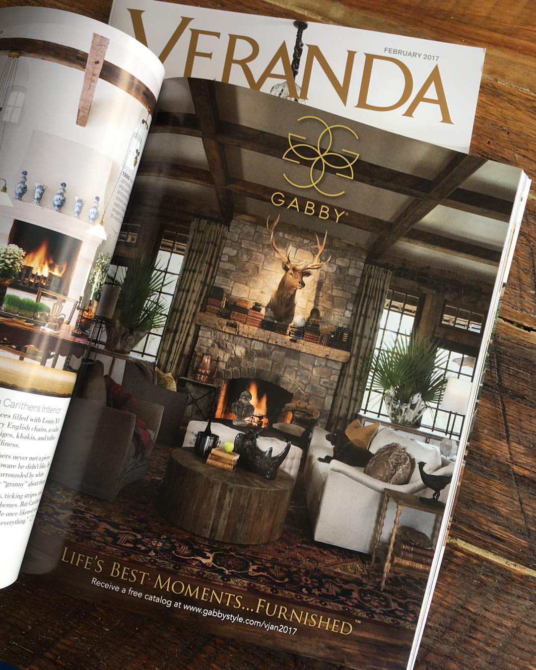
The finished product in the February 2017 Issue of Veranda Magazine.
I’ve been pretty behind on my blogging. Last year was one of my best years as a photographer and this year has gotten off to a pretty good start. As a result, I haven’t had very much in the way of free time. Between shooing, meetings, and editing there hasn’t been a lot of room for other things. However, I have made this blog a priority. In the coming weeks I’ll actually be expanding it’s role from just one of showcasing recent projects, to being a resource of trends, personalities, and insight for the area’s residential and commercial scene. So, if that’s something of interest to you, and I hope it is, be sure to hit the subscribe button, to get automatic updates!
As for this post, it’s really long over due!
Last year I got a call from Gabby Home (the indoor premium furniture line from Summer Classics). They were putting a full page ad together for Veranda Magazine and needed it shot on short notice. Of course I was happy to help out! The location was the hunting cabin for Summer Classic’s CEO, Bew White. Chris Hutchens, the amazingly talented creative director at Gabby, ran the shoot. It was the second time I did a location shoot with him so I already knew this was going to be a good one. The results certainly didn’t disappoint! We spent nearly the entire day taking out the existing furnishings and brining in new furniture, accents, a mounted elk head, and even multiple dogs. Every aspect of the shot from staging, to lighting, and composition were scrutinized and thought through. This was for a full page ad in Veranda Magazine, one of the premier home design publications in the country. It was an expensive ad and it had to be attention grabbing to make a return on that investment. I appreciated the trust placed by Chris and the entire Gabby team in me to execute their vision. The finished product came out in the February 2017 issue. Take a look and let me know, did we accomplish our goals?
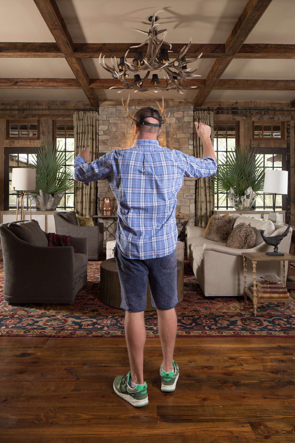
I had a little fun with Chris as he was orchestrating the shot!
Final image. Space was left at the top and bottom to accommodate the logo and copy. This final image is a composite of 8 individual images 14 total layers in Photoshop for a 1.2GB file!
Jones Orthodontics - Birmingham AL Commercial Interiors Photographer /
Dr Jones put a lot of thought and effort into making every part of his practice instill confidence in his patients. It was my job to capture that photographically. This image is a blend of multiple ambient and strobe exposures.
Recently I had the opportunity to photograph a brand new orthodontics office in Pelham. Dr Jones has been a practicing orthodontist with another group for some time but this is his first venture out on his own.
Not having an established clientele, Dr Jones needs to attract new patients. To help do this he knew that he had to establish credibility. Every detail from form to function was carefully thought through in the creation of the waiting, consultation, and treatment spaces. The practice was very well done but if know one saw it then that work would be wasted.
Dr Jones contacted me about creating images to do just that. He needed photos for his website, social media, and marketing materials. Having been a small business owner, and having started up business from scratch, I could relate to the stress, apprehension, hope, and excitement involved. I was honored to help him begin his practice and to help him become successful!
This image was especially challenging. The long narrow hallway from the treatment to waiting room was difficult to light. Controlling the reflections in the office glass, balancing multiple color temperatures, ambient and artificial light made for some creative techniques. In the end I think it came together pretty well!
Dr Jones was especially proud of his office/consultation room. A lot of effort went into it's styling and build out. The glass wall and door were the biggest challenge of the shot. They were creating HUGE reflections from all the light sources. Capturing the detail in the office without these reflections required digging deep into my bag of photographic tricks. I attached a large black cloth to a background stand and used it as a shield to block light coming in from the side. I only had enough to do half the office at a time. So I photographed the right, then broke it down and reset up on the left. I then blended the images in Photoshop to create the final result.
Need an orthodontist in the Pelham area? Lean more about Dr Jones and his practice on his website and Facebook pages.
See more of my commercial interiors photography.
Momentum - Commercial Architectural Photography Tuscaloosa AL /
Twilight exterior of the credit union headquarters. Twilight shots can be compelling attention grabbers. They're one of my favorite shots by far.
The marketing director at Momentum, a commercial builder based in Seattle, contacted me a little over a year ago about photographing a credit union they had built in Tuscaloosa. They liked my work but ultimately went with another photographer. Then something unusual and unexpected happened. A couple of months ago they contacted me again. They’d just finished building a headquarters for that same credit union, also in Tuscaloosa. This time they wanted me to shoot the project. Not that the other photographer was bad per se, the images just weren’t what they had in mind. Of course I was very happy to help out and appreciated the new opportunity.
I scouted the location inside and out when I was in town to photograph another project. I always prefer to see the space in advance of photographing it. This allows me to think through compositions, light, time, staging, and equipment needs ahead of time. Although not always possible, it does help things go more smoothly. In this case it was very valuable. The client and I were able to communicate at length to make sure we were on the same page. Given the distance and time zone issues between Alabama and Seattle, having that advance walkthrough was huge.
This was also a more rare case when we would incorporate people into more of the images. Momentum wanted to convey how the space was actually utilized and give it more of a “human” feel. We enlisted some of the credit union staff to serve as models. For some images we had them move and captured them as a blur to convey movement and energy. For others we had them interact to give a feeling of how the space was used. I was definitely tapping into my portrait and wedding photographer roots on this project!
The end result was one that the client was thrilled with! Here’s what they had to say:
“Tommy was very accommodating to our client's schedule and was respectful of their work environment to make sure the he was not disturbing their work during the shoot. The finished images were fanatic!” - Jay-E Emmingham Marketing Director
Long corridors like this are especially tough to photograph. Getting the exposures and lighting balanced is no small order!
Dusting off my portrait photographer skills, we incorporated people into some of the images to give a feel for space usage and some human energy.
Project Oglsby - Willow Homes Parade of Homes Entry /
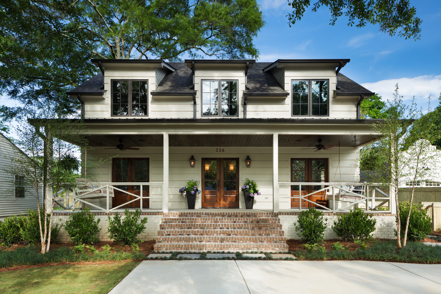
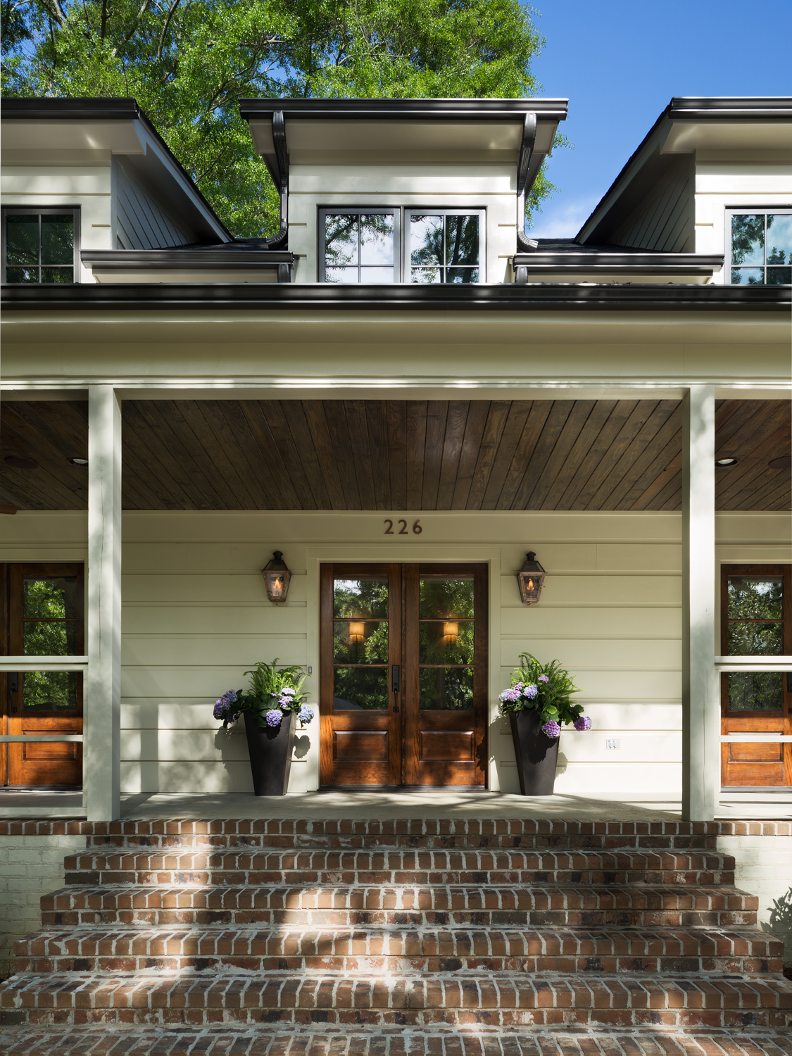
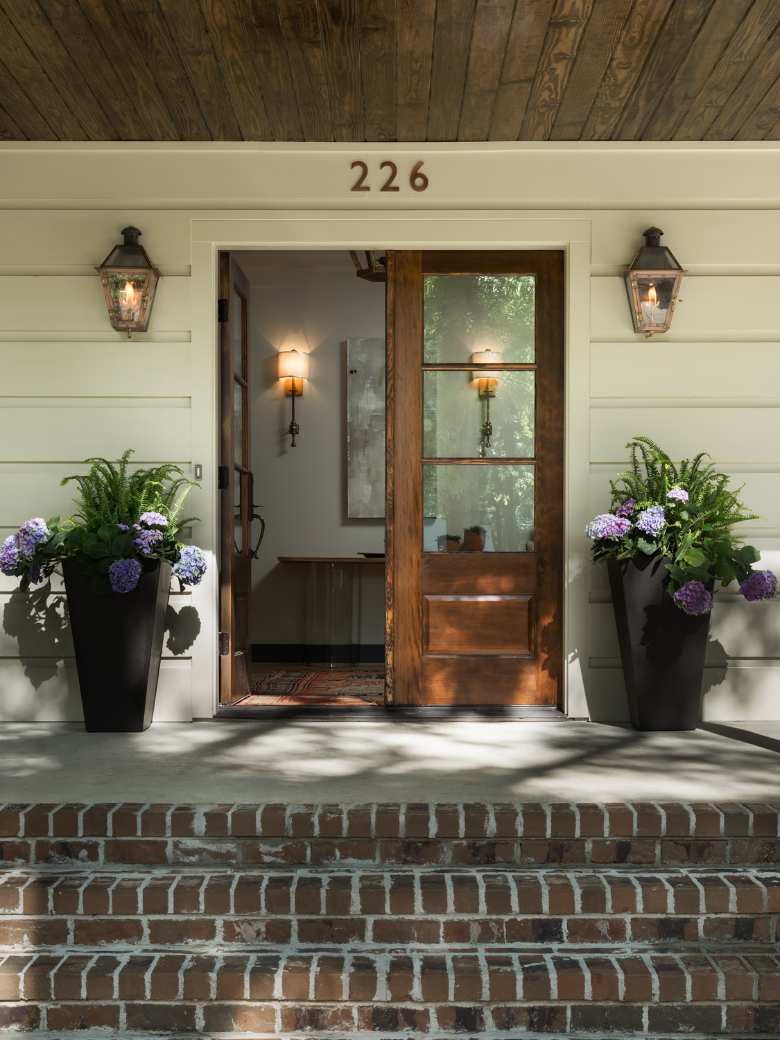
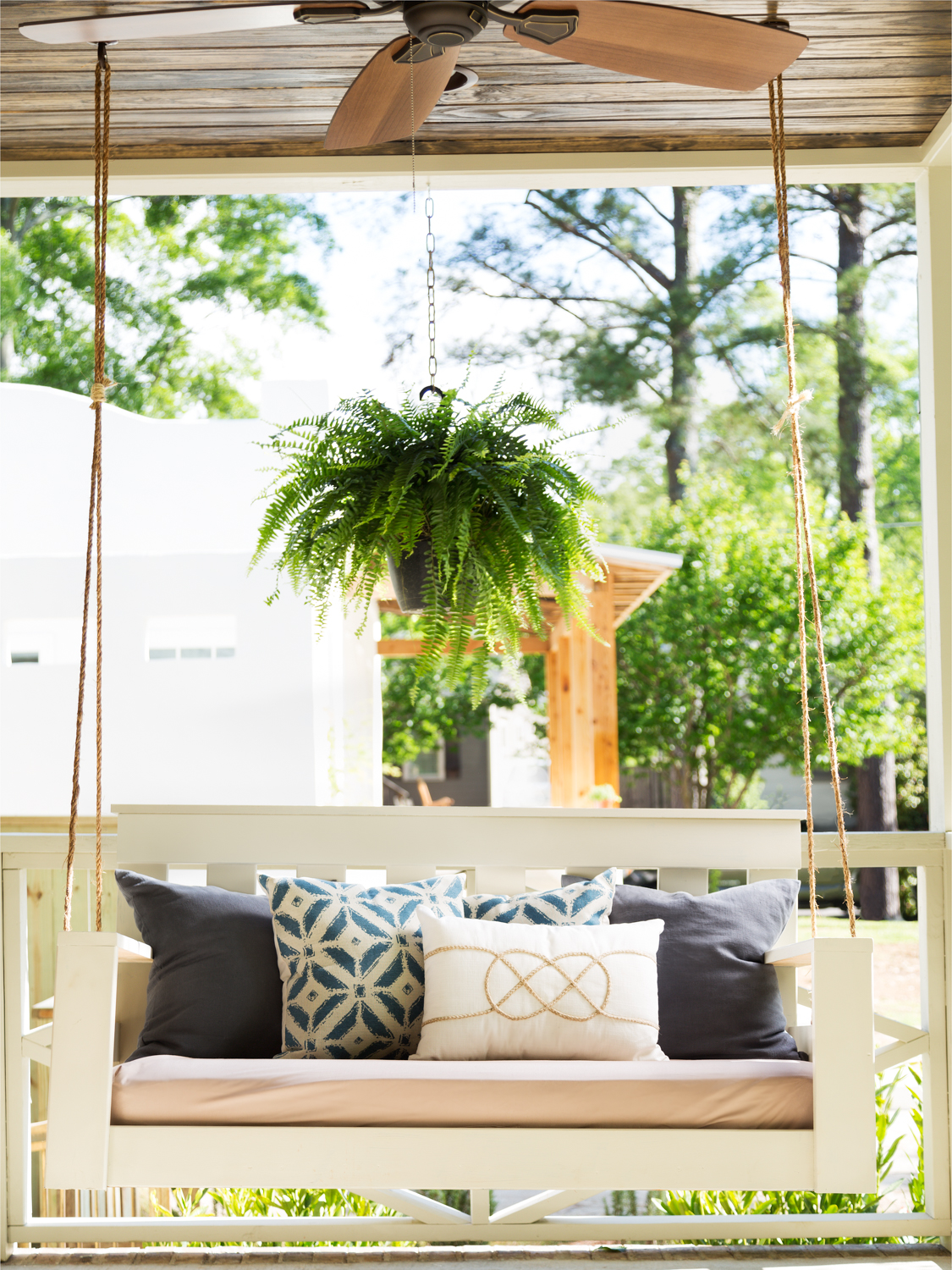
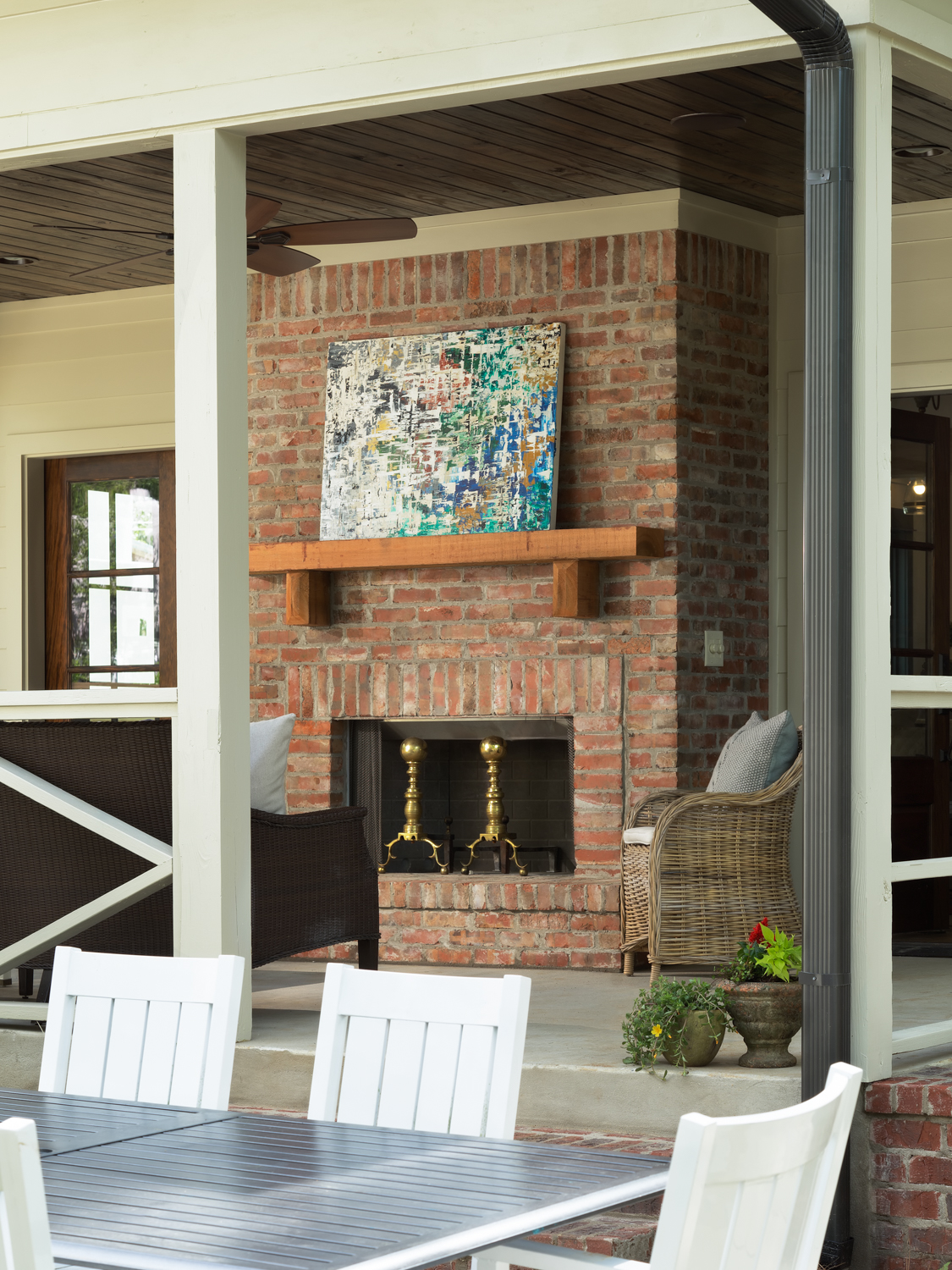
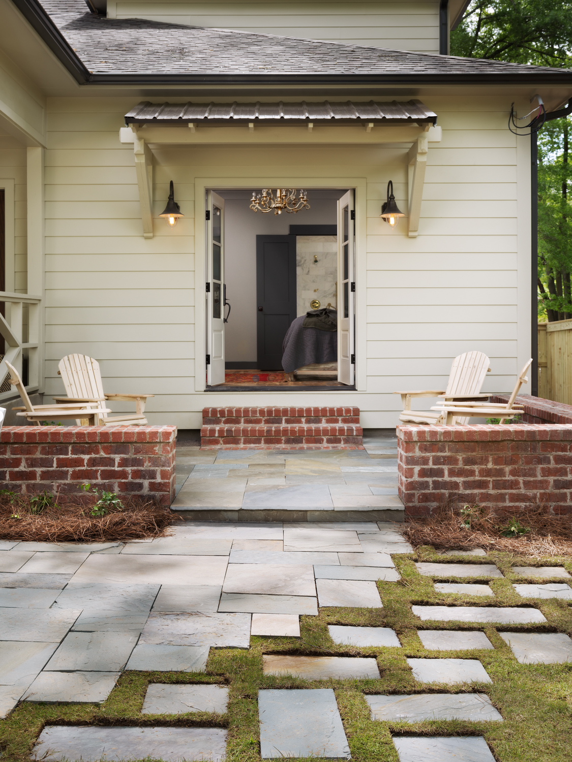
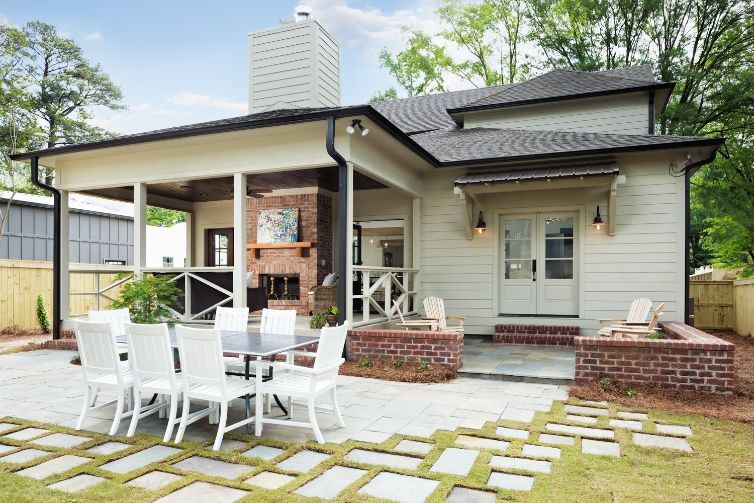
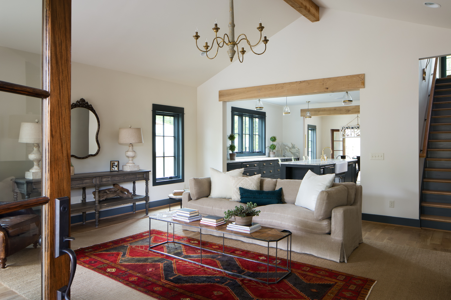
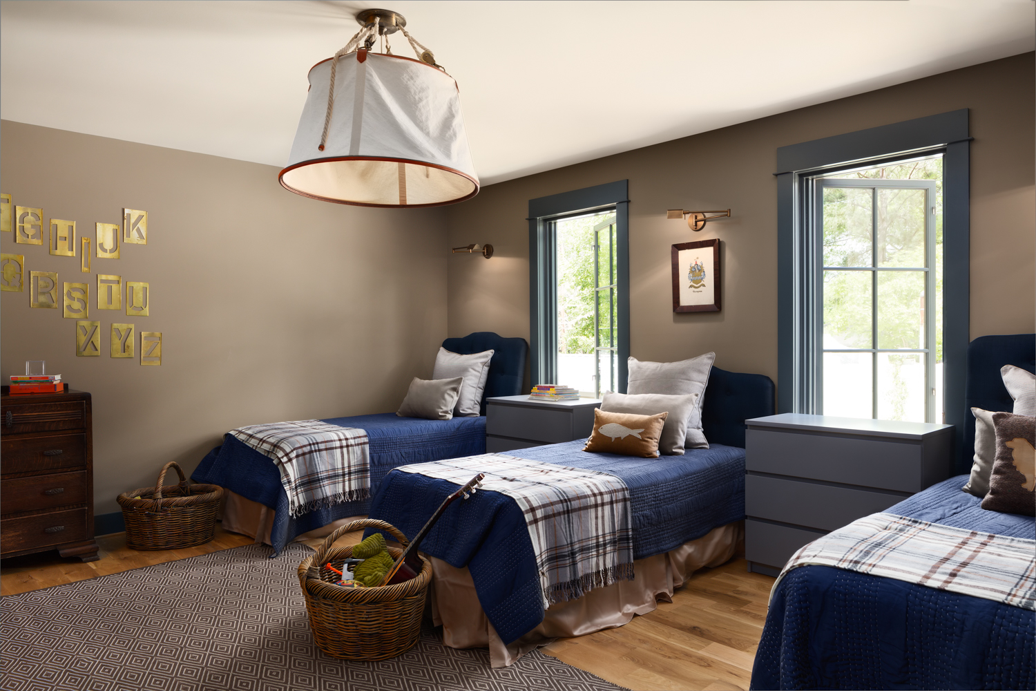
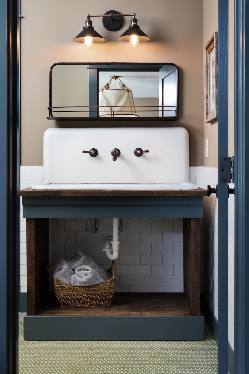
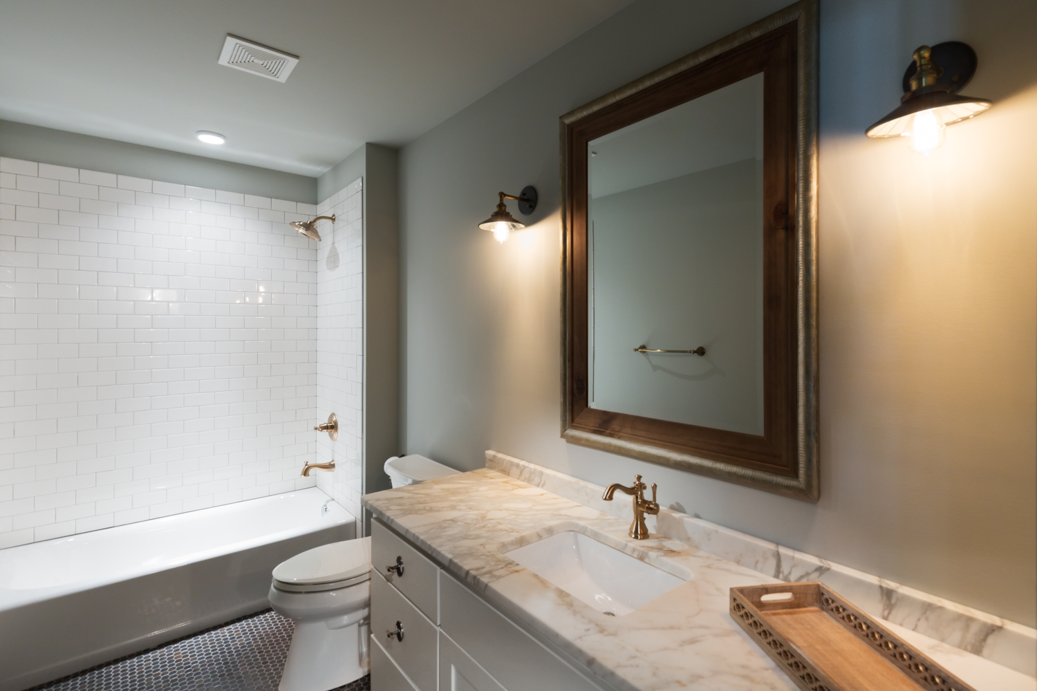
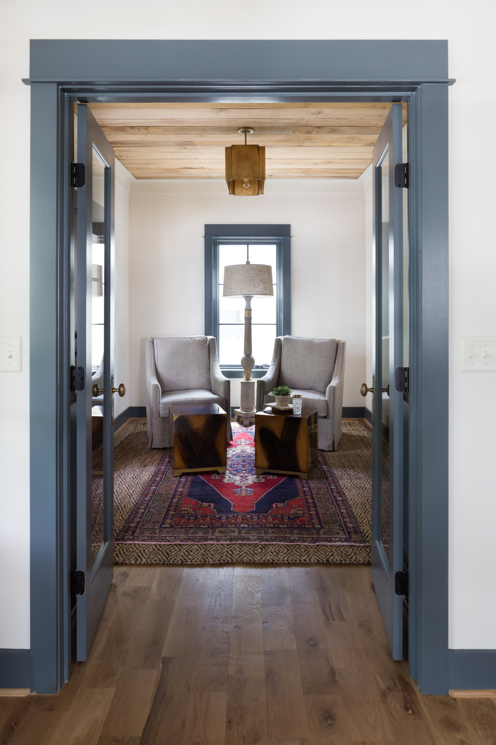
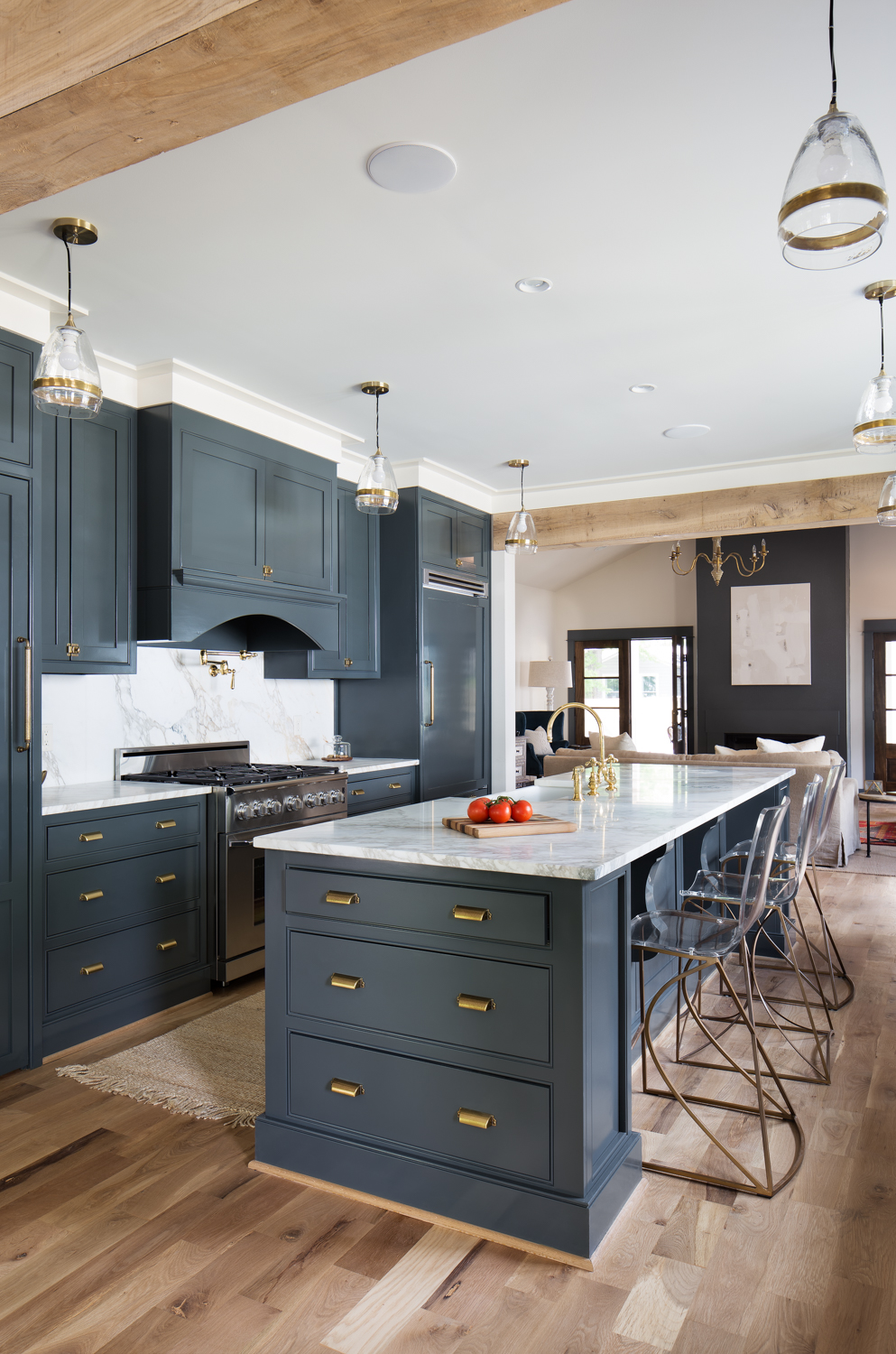
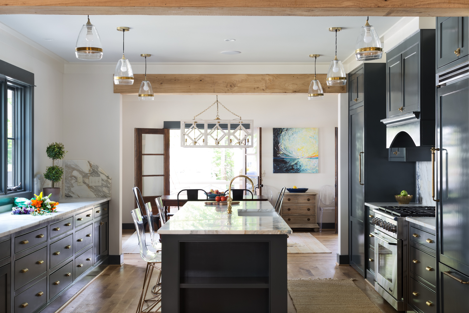
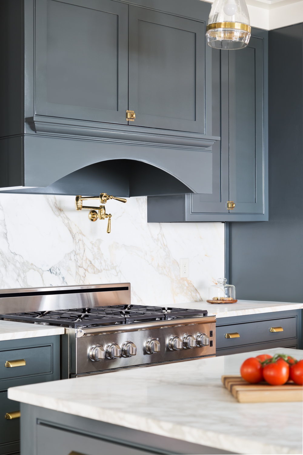
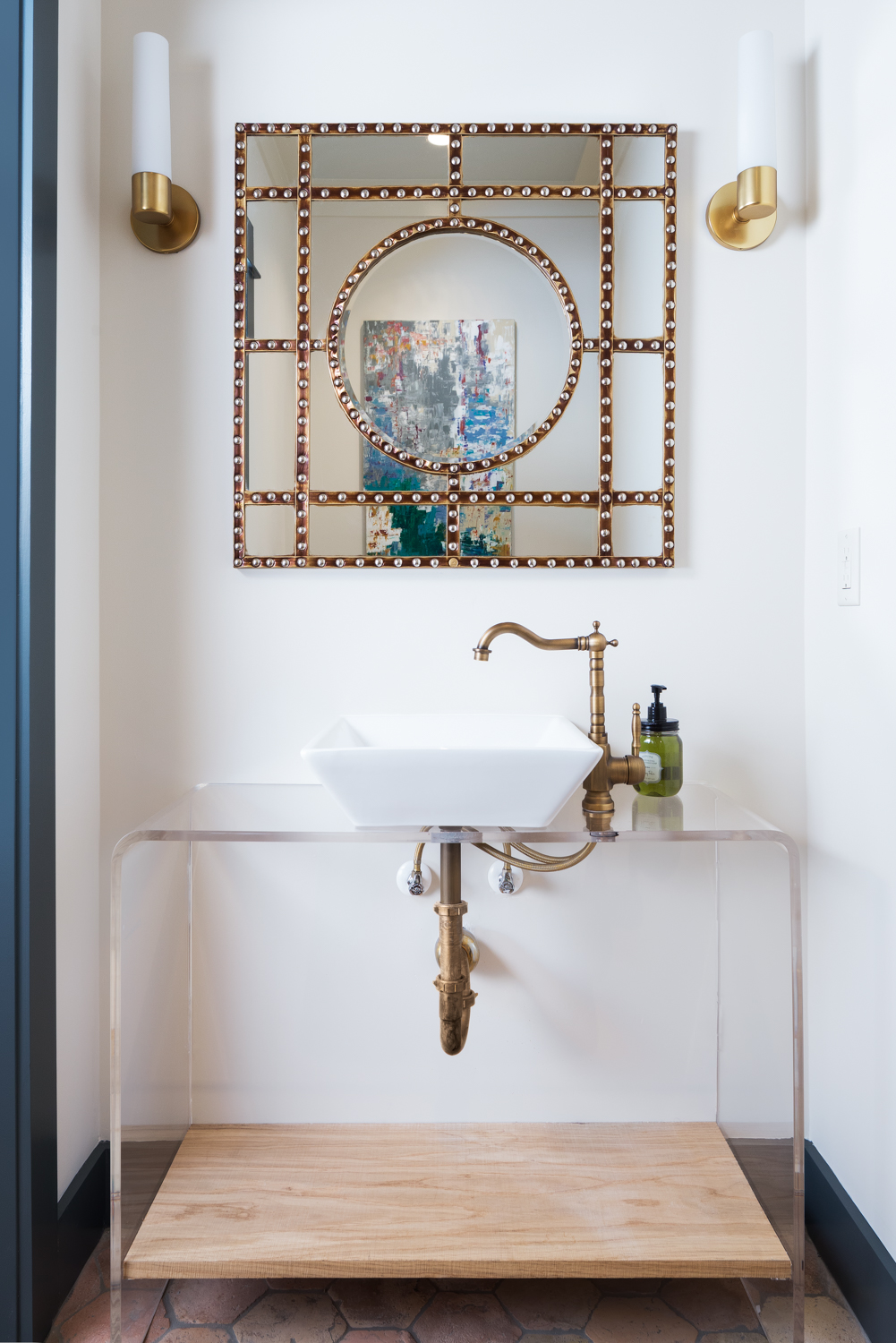
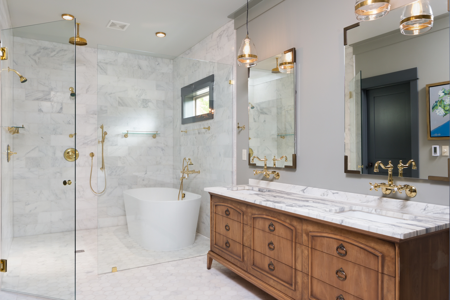
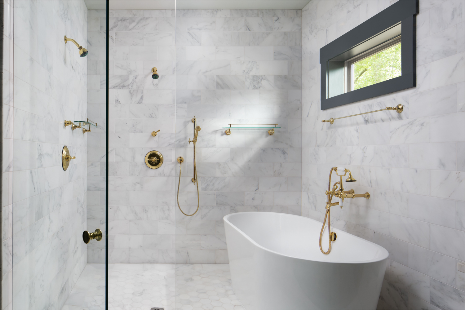
Recently I had the honor and pleasure of photographing the Birmingham Home Builders Association Parade of Homes entry for my great client Willow Homes and Willow Design Studio. This was the second year in a row that I’ve photographed their entry. I will say that I think both of us have come a long way in a short period of time!
This new construction home in Homewood is also the personal home of Katherine Bailey, on of the designers at Willow Design Studio. I’ve worked with her on a couple of their projects but there was a little added pressure to make sure this was done right (not that I don’t strive for perfection in every shoot! Honestly, Katherine really makes my job easier. She has a great sense of style and has everything styled perfectly for me. This really does make all the difference in the world. An empty room with four white walls is tough to photograph in an interesting way!
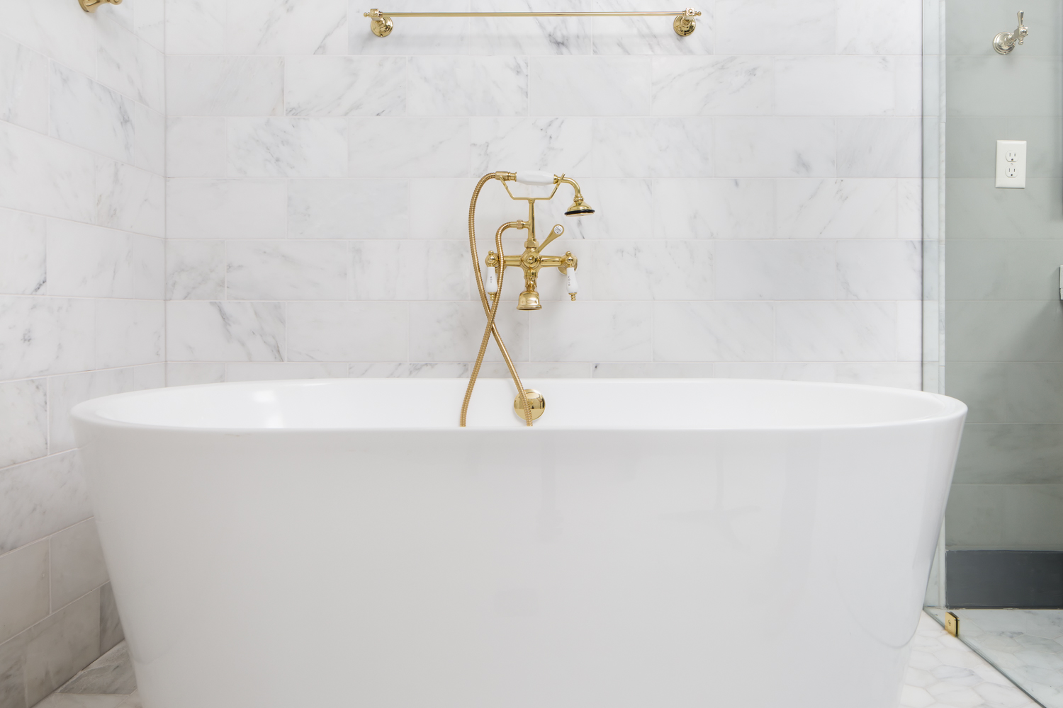
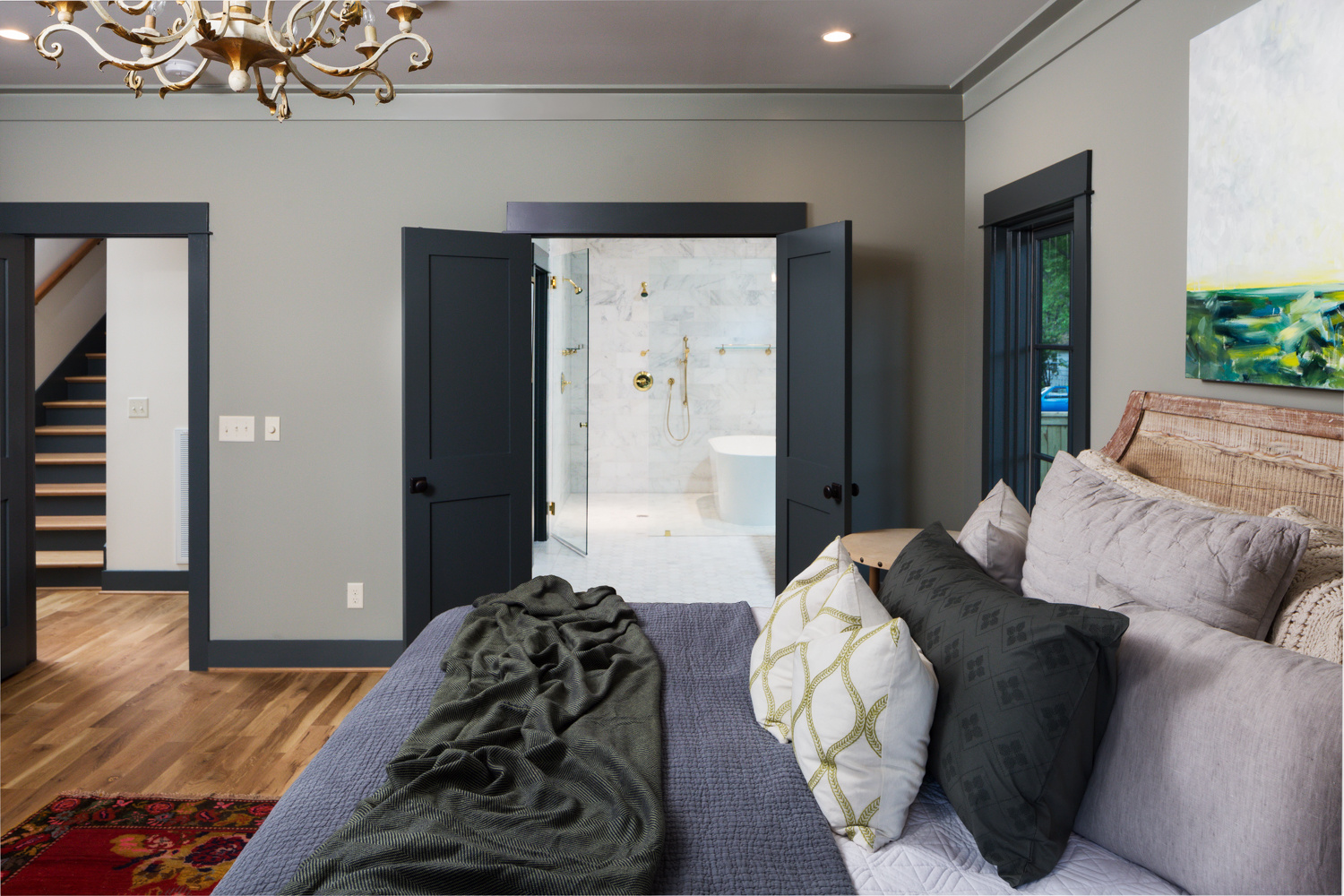
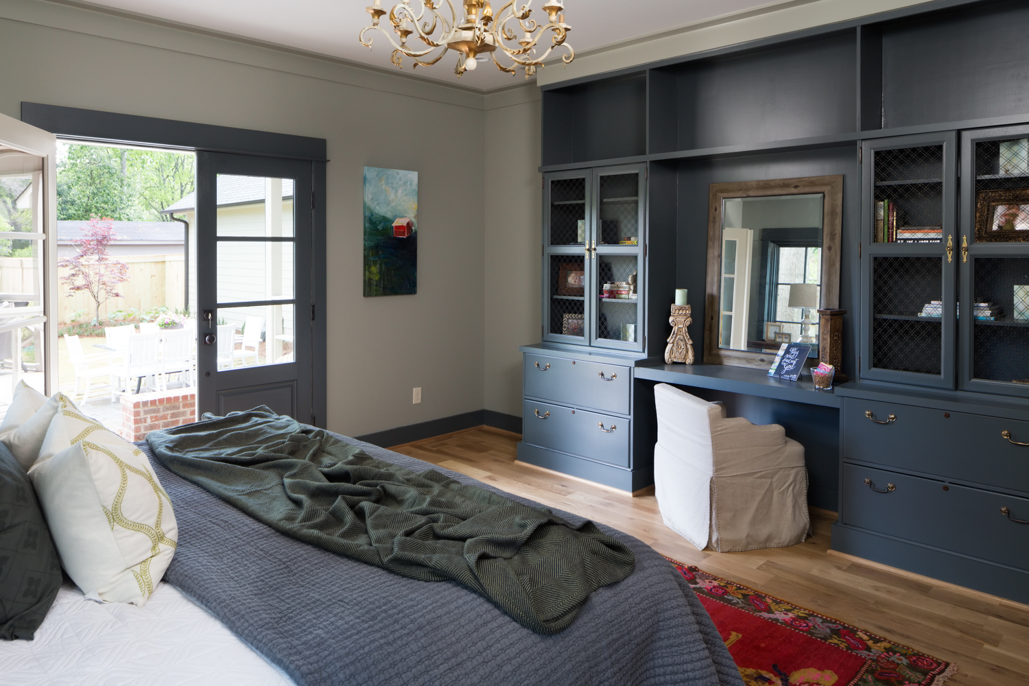
This project gave me so many opportunities for great images that it was kind of hard to narrow them down. I could have spent a couple of days there easily! I wasn’t the only one to notice this either. The mega all things homes website Houzz did an article on the home as well!
click on thumbnail for larger image
Are you a home builder, architect, or designer in need of professional photography to showcase your work? Contact me today to discuss your needs!

