Birmingham

Small Home with Big Heart - Homewood AL Residential Photography by Tommy Daspit

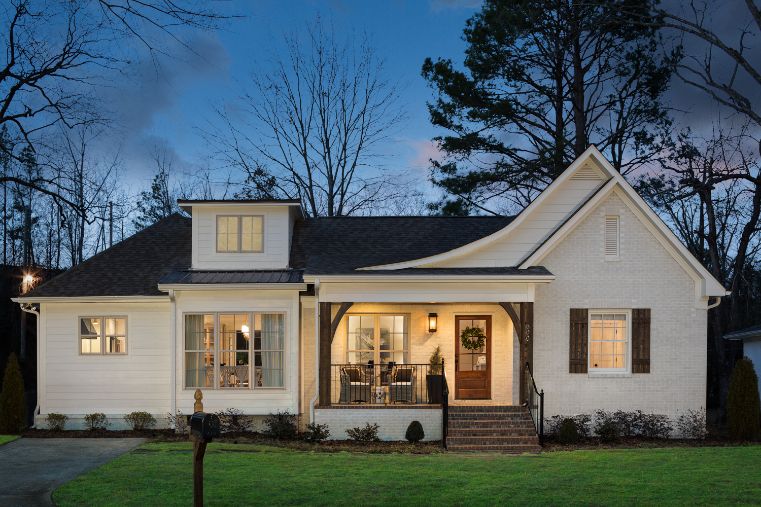
Twilight Exterior of the front-  I actually came back a week later to get the exterior from the interior. One of our frequent late after noon thunderstorms struck and kept on striking for the several days that followed. Finally last Friday it looked like we would catch a break and I rushed out there. The light was absolutely perfect and I was able to get this just before ANOTHER thunderstorm hit that evening. Weather plays a big part in what I do and sometimes you just have to be ready to move quickly or be flexible.

My daughter did a little behind the scenes video of me loading all of my gear in the back of the car for this shoot. People are always amazed at how much is involved in putting a project together.

My oldest daughter, Aanae, is a great photographer in her own right. She wanted to assist me on this shoot. Little did she know, cleaning is a big part of residential interiors photography! I carry a cleaning kit with specialty cleaners for wood, st…

My oldest daughter, Aanae, is a great photographer in her own right. She wanted to assist me on this shoot. Little did she know, cleaning is a big part of residential interiors photography! I carry a cleaning kit with specialty cleaners for wood, stainless steel, acrylic, glass, stone, and flooring. It's much better to fix it in real life than to "fix it in Photoshop".

A lot more goes into the creation of an image than pointing a camera and pressing a button. When it comes to architectural and interiors photography color accuracy is especially critical. Architects, designers, and builders use my images to market their services but also as design consultation tools with clients. It's vitally important that the images accurately reflect the paint and material colors. I use a color reference chart with each scene to use in post production. I have a calibrated monitor, use colored gels on my lights to match ambient light color temperature, and have a calibration profile for each lens and camera combination I own. All of this combined helps me create images with the most accurate color possible. 

The final image is a composite of multiple shots. I use Gobos (the large blackout cloth on the background stand) to control reflections in glass. That way you can actually see the amazing tile in the shower instead a big white square from the window…

The final image is a composite of multiple shots. I use Gobos (the large blackout cloth on the background stand) to control reflections in glass. That way you can actually see the amazing tile in the shower instead a big white square from the window light. 

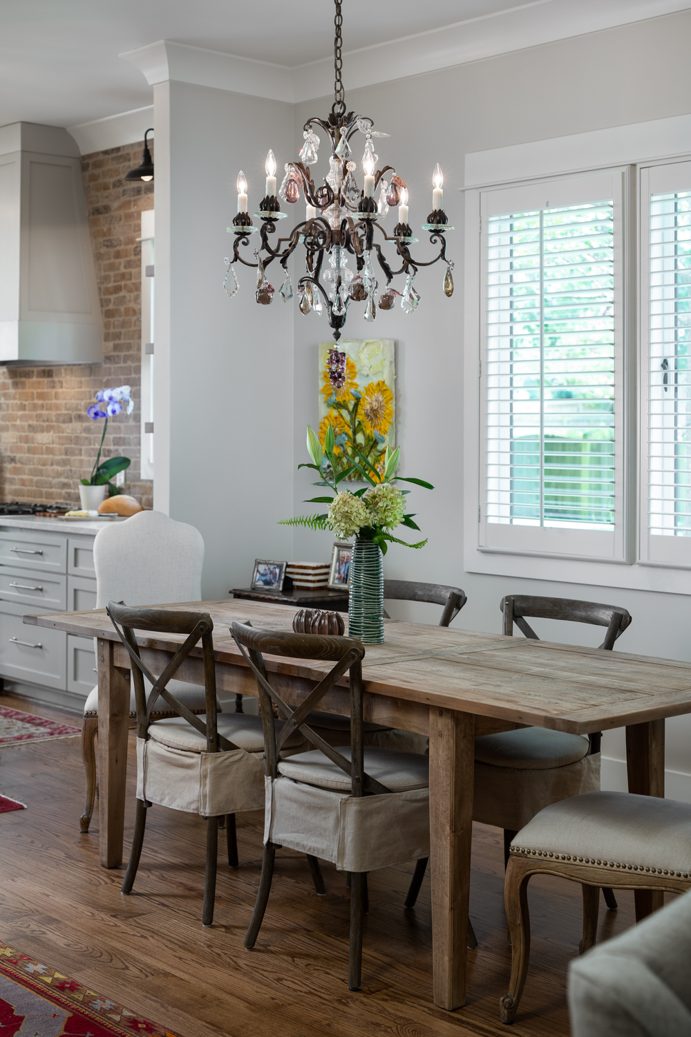
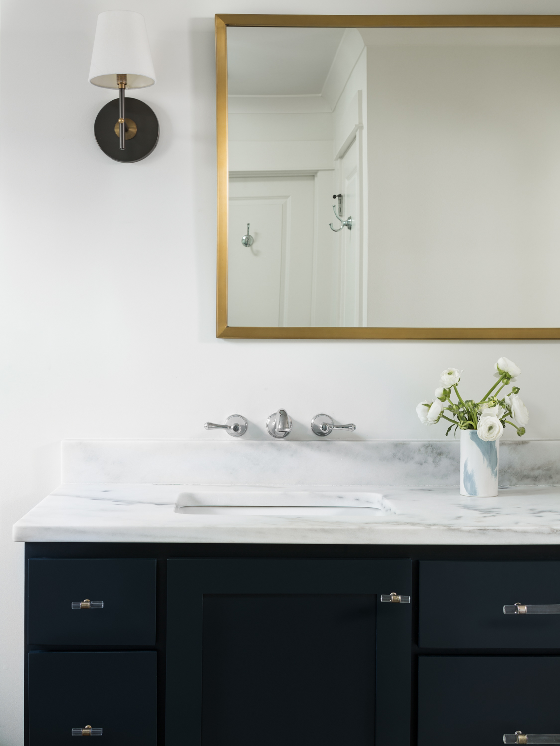
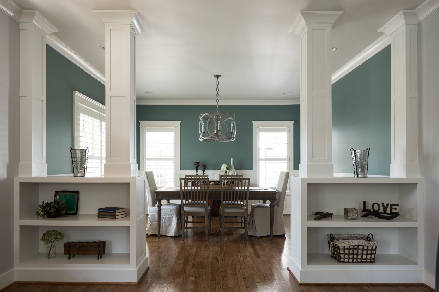
A house doesn’t have to be big to be a great home. This recent project I photographed for Willow Homes, Willow Design Studios, and Triton Stone Group in Homewood, epitomizes that idea. 

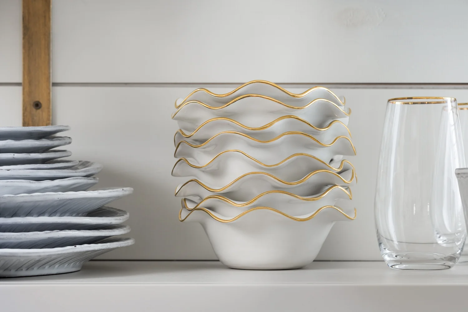
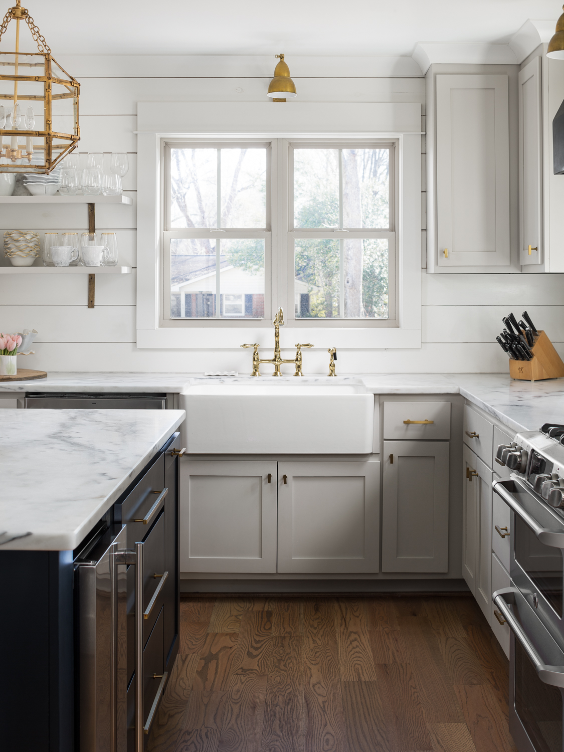
Like other projects from Willow, this three bed, two and a half bath house, fits in perfectly with its historic Homewood neighborhood. It blends a timeless style with modern functionality and quality. I especially love the look of the white painted brick with the rough exposed beams on the front porch. On the inside, the kitchen is just phenomenal. The exposed brick wall looks like it was taken from a hundred year old downtown loft. All the materials, combined with open shelves, and well designed layout, make for a kitchen that will always look great!

Click on thumbnail to view larger image

Builder - Willow Homes
Interior Design - Willow Design Studios
Tile, Counters, and Plumbing Fixtures - Triton Stone Group

See more of my residential architectural and interiors photography portfolio.

Forest Remodel - Homewood Al Residential Interiors Photography by Tommy Daspit

Twilight Exterior of Susan Gordon's Homewood Alabama home. It won best in Show in the Greater Birmingam Homebuilders Association Remodel competition.

Twilight Exterior of Susan Gordon's Homewood Alabama home. It won best in Show in the Greater Birmingam Homebuilders Association Remodel competition.

I’ve been looking forward to sharing this project for quite some time! I photographed this project (the remodeled home of the famous Susan Gordon of Susan Gordon Pottery) back in February. I had to hold off posting about it until the article about it was published this month in Birmingham Magazine. Although it won Best in Show for the 2018 Greater Birmingham Homebuilders Association remodeling competition and was published in their quarterly magazine, it’s customary to hold off posting about a project when there’s a pending article on it.

There was so much awesomeness in this project that it’s no surprise that it won awards and much acclaim. It was a joint project with Willow Homes, Willow Design Studio (Katherine Bailey Designer), Chickadee Interiors, and of course, the amazingly talented Susan Gordon herself. I especially loved the kitchen.The open space with the living and dining rooms with the kitchen provided some fun challenges but I think we captured the essence of the space well. I especially loved the combination of traditional cabinetry with the open shelves that showcased Susan’s craftwork. I employed nearly every technique in my arsenal to control and enhance the natural light in the space to capture the feeling of being there. I’m very proud of that my images helped Willow Homes and Willow Design capture the Best in Show award for the remodeling competition. Ultimately my job is to help my clients showcase their hard work with the highest possible quality images. That it was award winning and showcased by Alabama Homebuilder and Birmingham Magazine only validates all that went into creating those images.

I’m honored to have been a part of capturing this amazing remodel and proud of my clients, and my team for all of their hard work!

click on thumbnail to view larger image

Birmingham Magazine July 2018

Alabama Homebuilder Magazine Spring 2018

Willow Homes Craftsman - Birmingham AL Architectural Photographer by Tommy Daspit

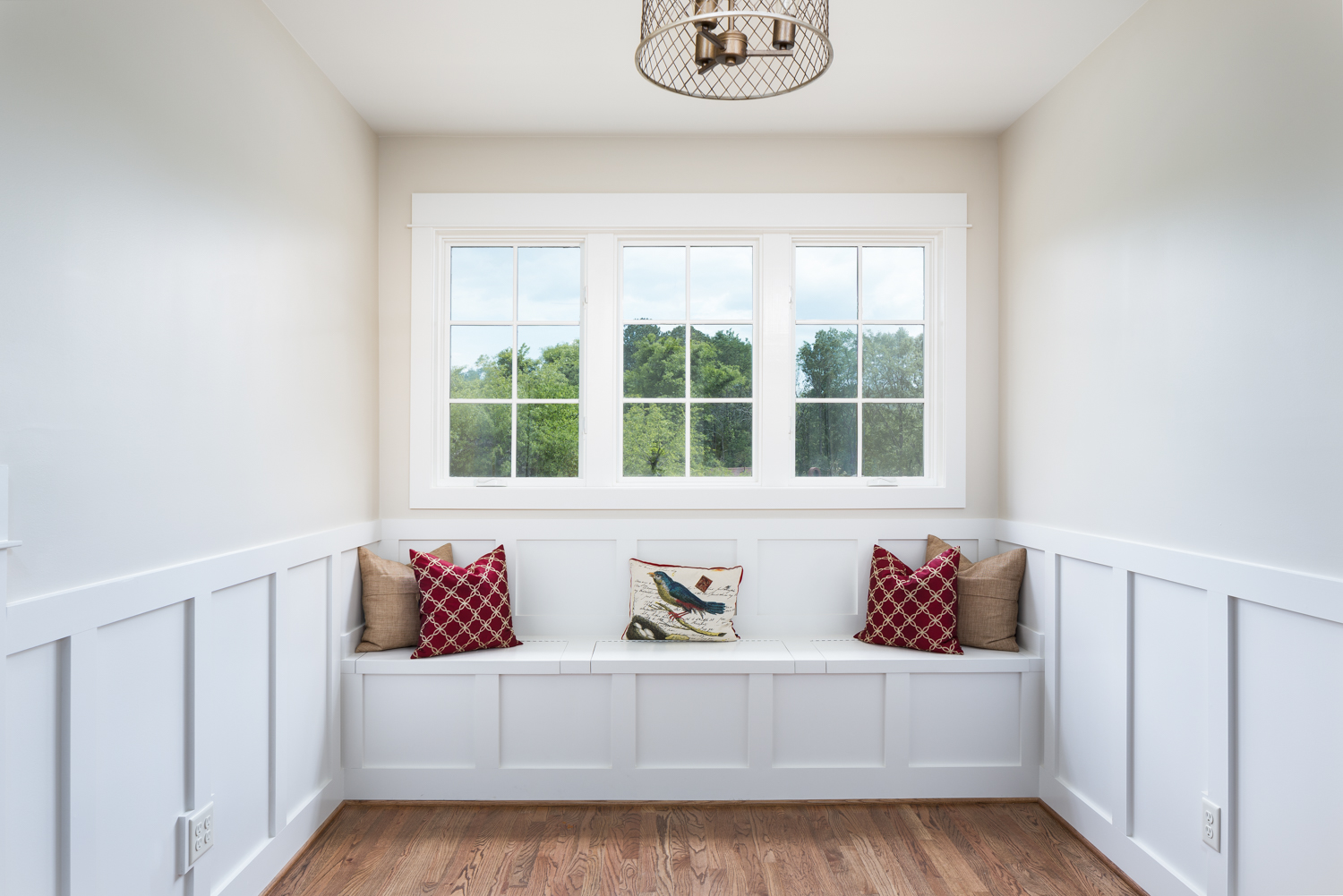
As with most of my images, this one is a blend of strobe and ambient light. I really liked the quality of light and shadow being created by those fantastic plantation shutters. My assistant Crys is actually outside with a large strobe on a light stand shooting light into the window. This allowed me to embellish the natural light and give it more contrast.

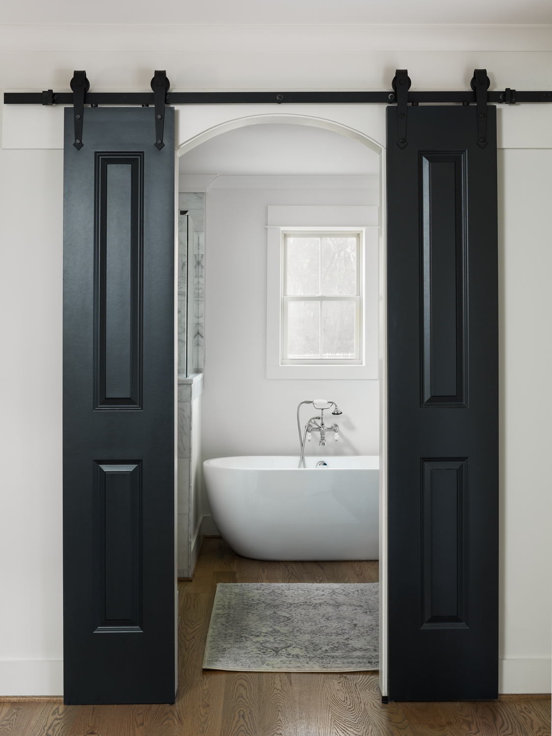
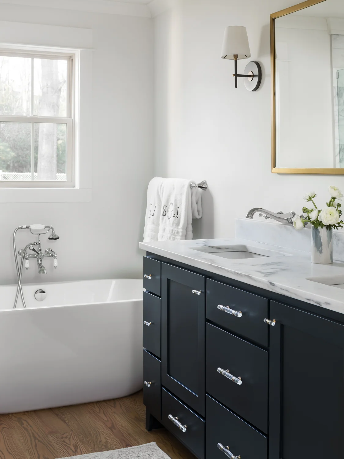
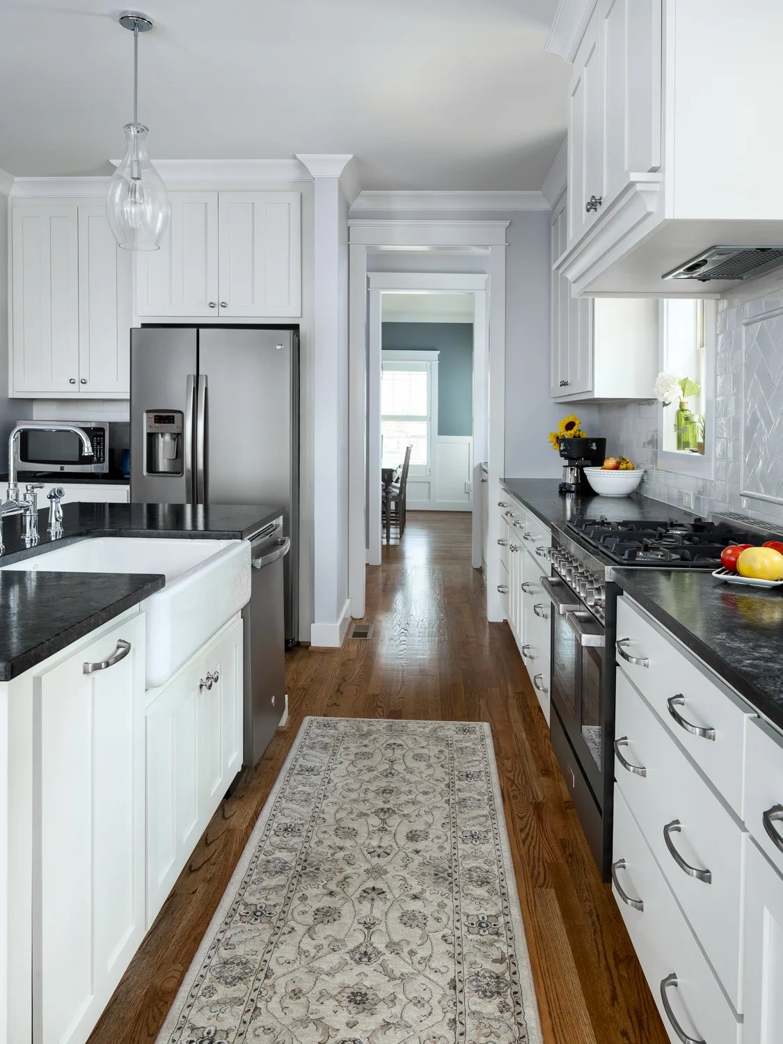
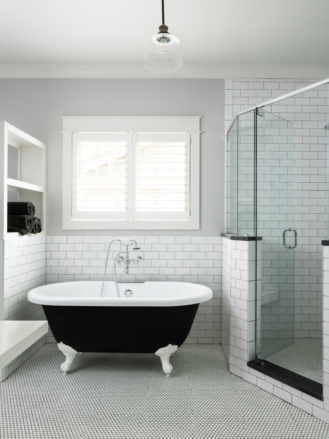
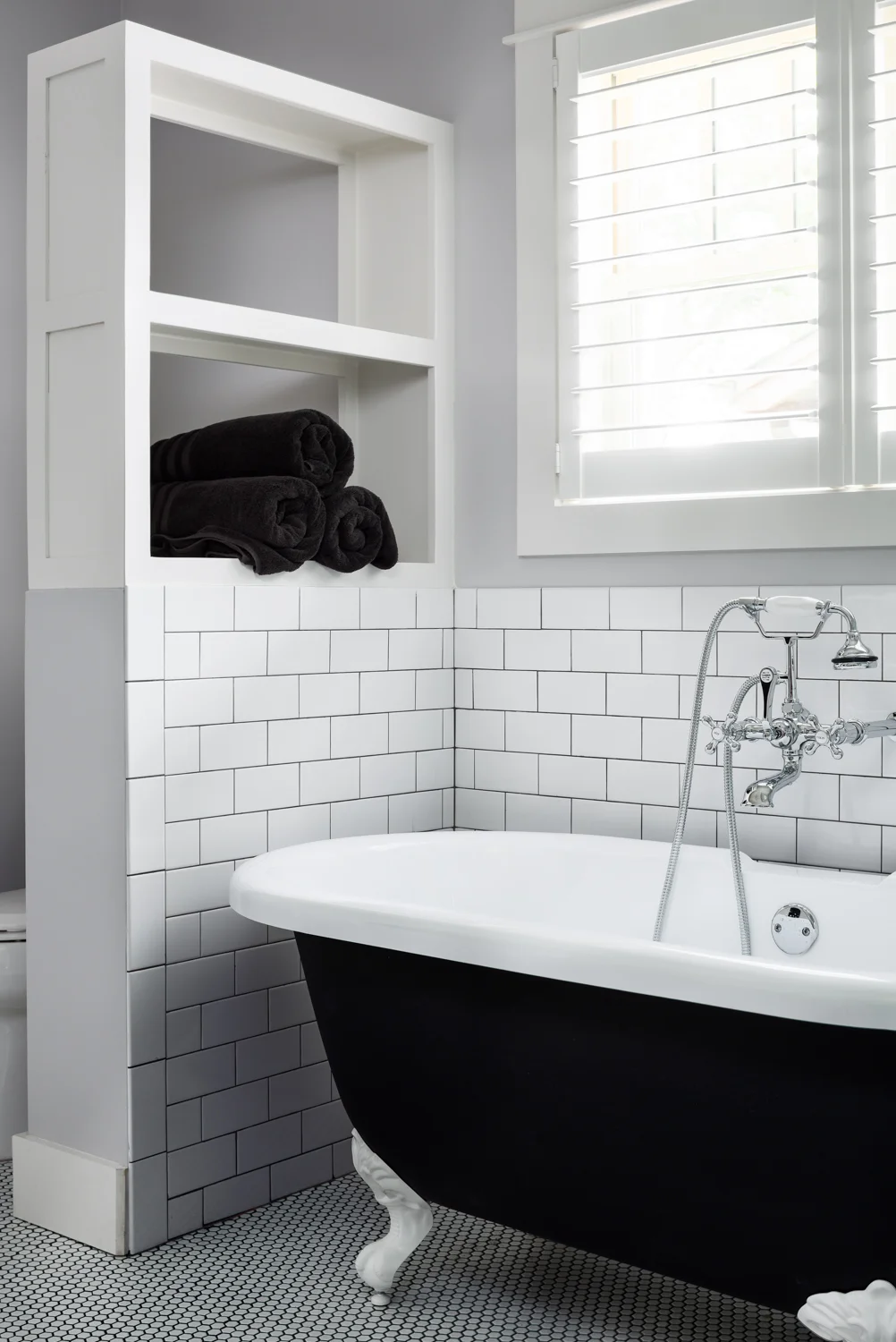
Another great house by Willow Homes and Willow Design but this one was a little bit of a departure for them. Until this home in Crestwood area of Birmingham, I’d never photographed a home of theirs outside of Homewood. It’s great to see them expanding beyond their niche market and into Birmingham, Mountain Brook, and beyond! Wherever it is, I’m always thrilled to work with Jason, Katherine, Allison, Lizzy, and the entire Willow team. Every project has great portfolio opportunities for me and I love seeing them grow as a company! This Craftsman inspired home was no exception. I loved every aspect of this project but I must say that the master bathroom and kitchen were some of my all time favorites. I am super jealous of the matte finished appliances. They just look amazing and are much easier to maintain than stainless steel. Then there’s the contrast of black and white for the master bath. I’ve never seen a tub like that and how it all came together with simplicity and class is so impressive!

Silde back and forth to see the straight out of camera image and final edited image

Each final image is a composite of multiple images. I blend ambient images with ones lit by my strobes. In this case I have a strobe outside the left window to add contrast to the natural light. There's another one behind the camera filling in the foreground. In Photoshop I remove anything that distracts from the finished design and balance the colors with a calibrated reference target.

click thumbnail to view larger images

Office Environments - Birmingham AL Commercial Interiors Photography by Tommy Daspit

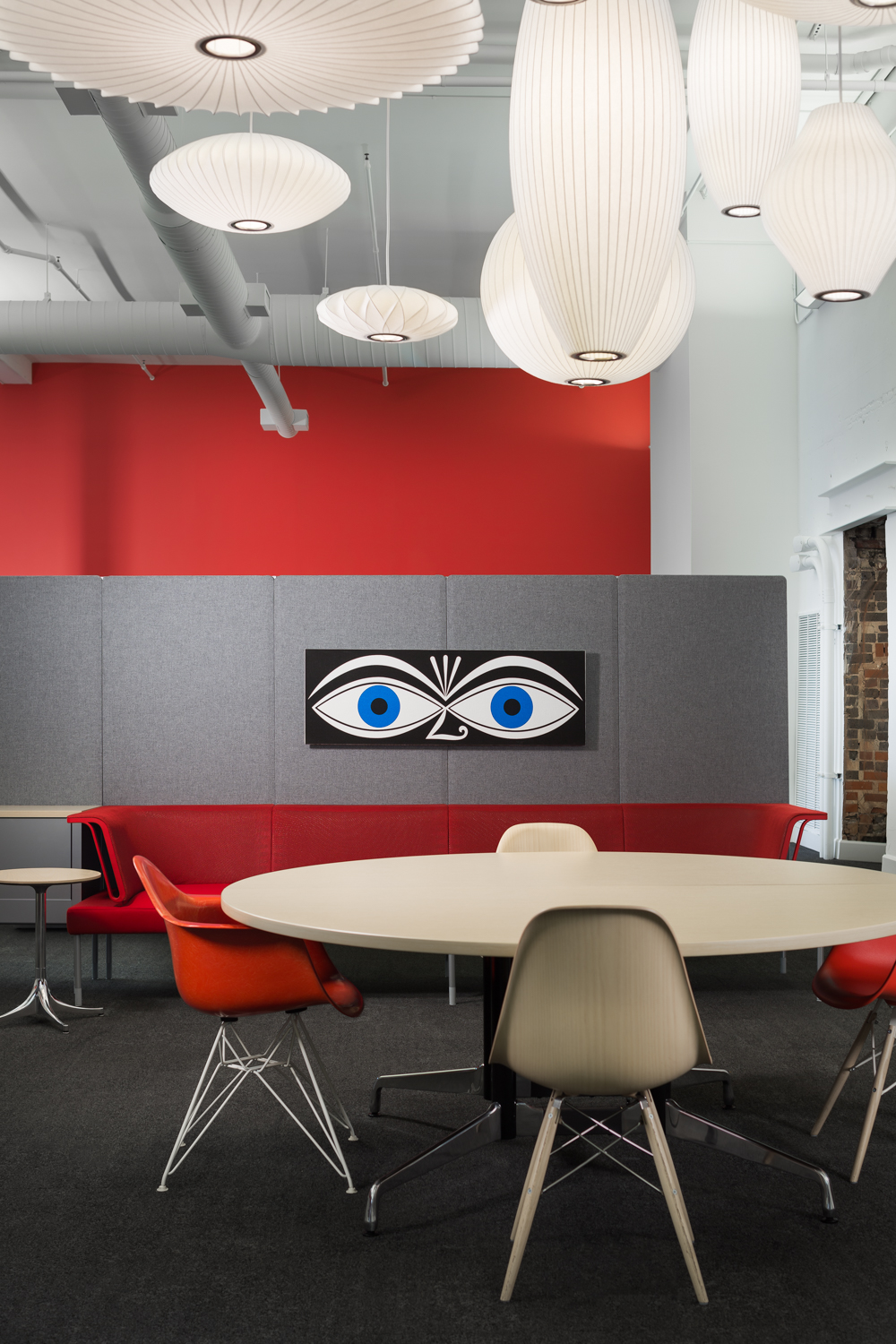
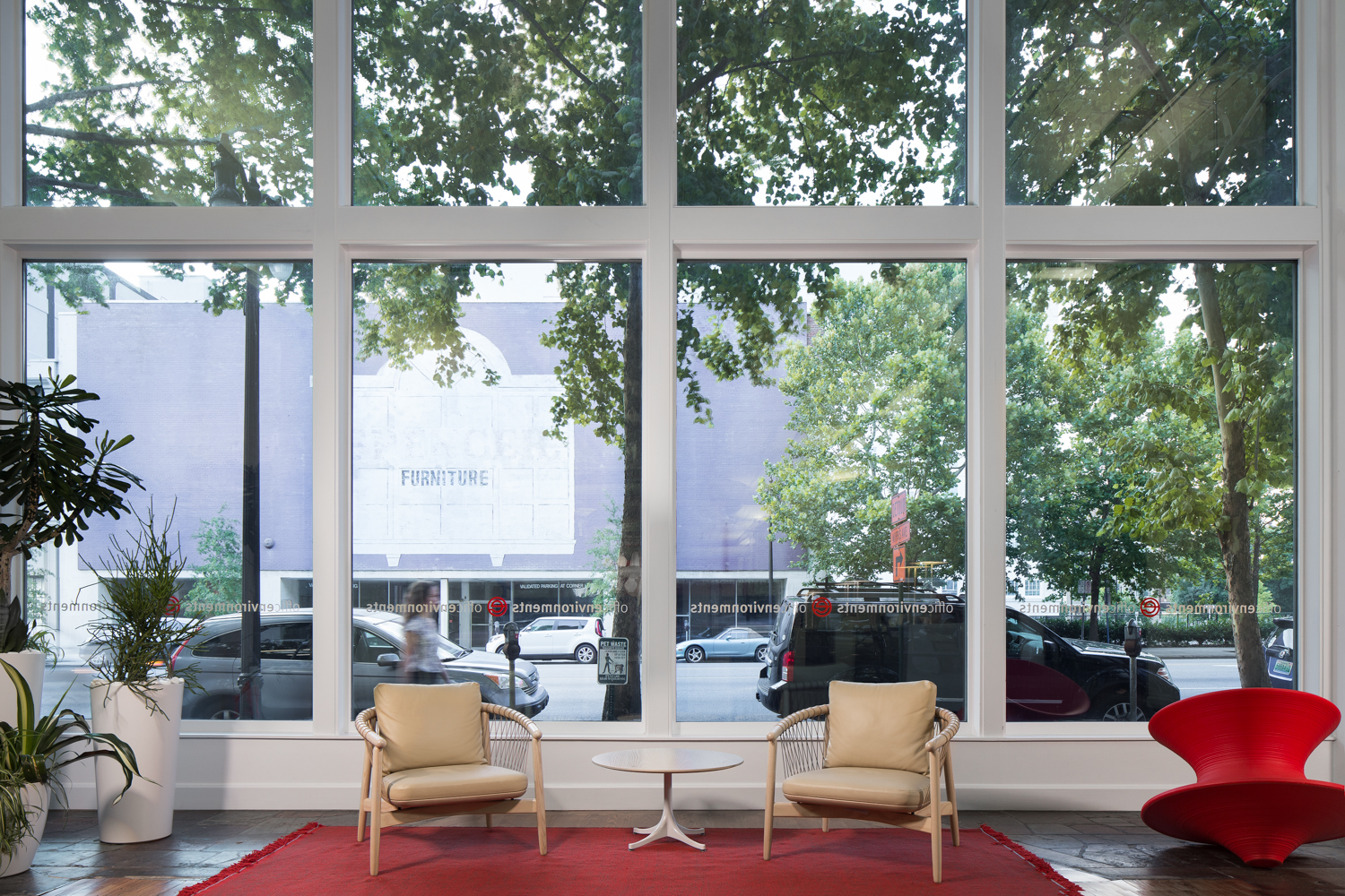
Click on image to view larger - Conference room at Office Environments in Birmingham. This shot was particularly difficult due to the large windows and all the reflections in them. I utilized several techniques to control them. The final image is a combination of multiple ambient and strobe exposures.

I recently photographed the newly remodeled showroom of Office Environments in downtown Birmingham. This is a shoot that I’ve been looking forward to working on and showing off for some time. When I first saw the remodel late last year I knew it was a project I wanted to capture. My residential portfolio is quite extensive but my commercial work is more limited. This is especially true for interiors. Fortunately for me one of Office Environment’s reps is in my BNI (Business Networking International), and we were able to work out a deal!

I really loved every aspect of this space. It’s in a historic downtown building and showcases some of the very best in modern office furniture design. As a Herman Miller dealer everything is top notch quality and style. It was my job to capture the feeling of this showroom and business in photographic form. These images would be used by Office Environments on their website, social media, marketing materials and advertisements. These images will represent them to potential clients and partners. I needed to make sure they captured the quality of not only the furniture, but Office Environments, and the great people that work there as well.

This was to be a little different as well because we did the shoot at night after they closed. This gave me a great opportunity to have some images with a very different look from the rest of my portfolio. Most images I create are done with a mixture of sun and ambient light. Night images take out the sun variable but add a new layer of complexity. There’s much more heavy lifting to be done by the strobes and I had to be careful not to make the images look too “flashy”. The resulting images are a blend of multiple shots blended together. Some are as few as three all the way up to the office overview which is about twenty. 

In the end with a lot of help from my assistant Crys and Blake Stringer from Office Environments we were able to pull it off!

Click Thumbnail to view larger images.

See more of my commercial interiors portfolio.

Gabby Catalog - Birmingham AL Interiors Photographer by Tommy Daspit

This shot is a blend of strobe and ambient light but mostly strobe. That allows me to more precisely control the color, shadow, and depth of light. Even with strobe the goal is to create an image that looks natural and truly represents the feel of t…

This shot is a blend of strobe and ambient light but mostly strobe. That allows me to more precisely control the color, shadow, and depth of light. Even with strobe the goal is to create an image that looks natural and truly represents the feel of the space.

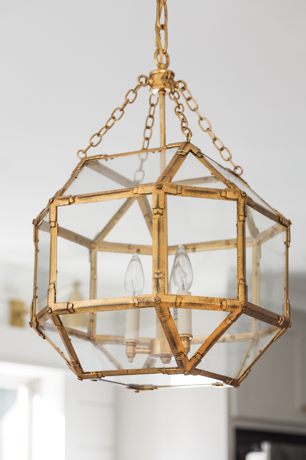
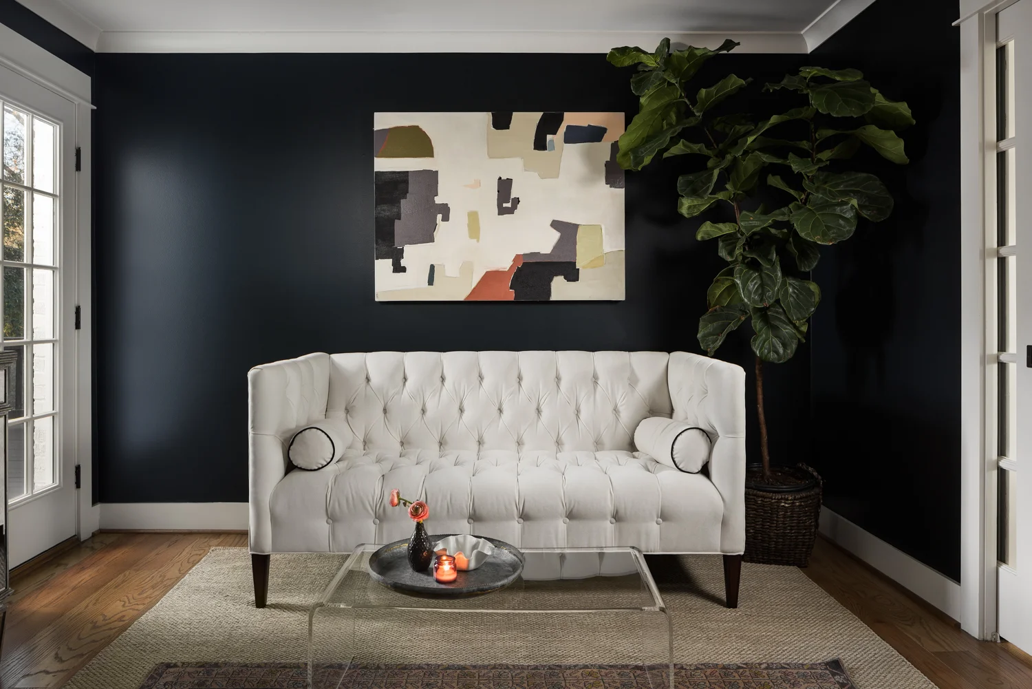
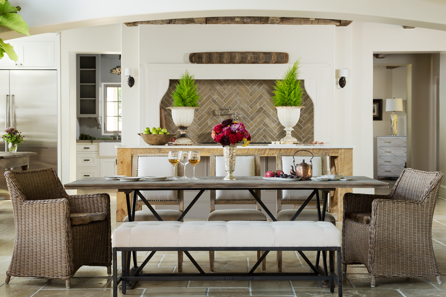
A few months back I did a photoshoot for Gabby, the luxury indoor furniture line of Summer Classics. They wanted me to shoot their upcoming “Illuminate” catalog images. These weren’t the individual item shots done against a solid white background. Rather, these are what are called “Cadillac” shots and vignettes. I was to create the images that would show the furniture, lighting, and accessories in use and in a space. My job was to give the catalog viewer a better sense of how the items would come together in a real home. This is very similar to an interiors shoot that I might do for an interior decorator or designer. Now that the catalog is out I can share some of the images we created (see the catalog here).

For two days we took over the home owned by Jana and Danny McEachern of J&D Farms, in Gadsden. The Gabby team took out most of their furniture and replaced it with the catalog pieces. Each vignette was carefully crafted and staged by the amazingly talented Chris Hutchens, Gabby’s creative director. He really appreciated one of my favorite pieces of kit, my Camranger and iPad set up. Normally, the photographer gets the shot basically framed up and the designer goes back and forth to look through the camera as the shot is being arranged. Move a couch, go look through the lens, move it again, go look through the lens. On and on this goes. It can be a little less that ideal. With the Camranger I’m able to set the camera up, turn on live view, and hand an iPad to the designer. They can see in real time as they move things around, add and subtract props, and know exactly how the shot will look when put together. It has totally revolutionized the process. We can now get more shots in and the results are more inline with the artistic vision the creative team has!

I loved working with the entire Gabby team. The opportunity to collaborate with so many talented creative minds, with a great setting, and fantastic subject matter is amazing. It’s why I love what I do for a living so much! Be sure to check out the December issue of Veranda Magazine for a shot I did with Gabby for a full page Ad!

A capture from the catalog. It never gets old seeing a caption and page number along with your images! Again, this is a blend of strobe and ambient exposures. The chandelier was added from a separate image in post.

Chris is doing some finishing touches on the styling while I'm getting a color reference target shot. I'm triggering the camera from the iPad with the Camranger. The graycard I'm holding will be used in Lightroom to set the color temperature. That way the colors of the products are accurately represented in the final results. The chandelier was added in post on this image too.