Gabby Home

Gabby Home Veranda Magazine AD Shoot by Tommy Daspit

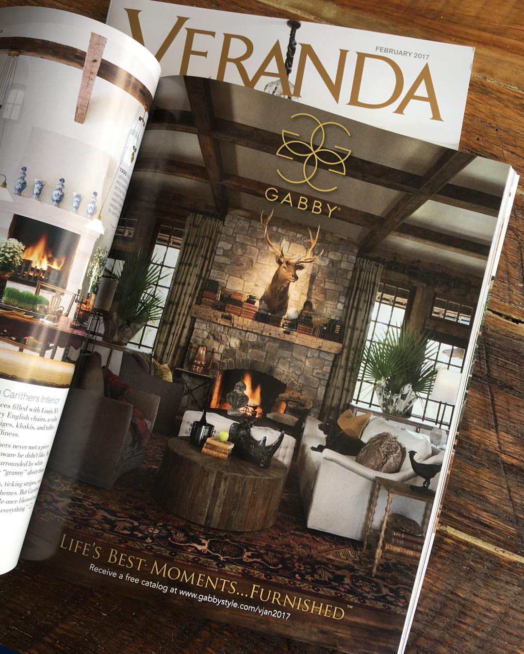
The finished product in the February 2017 Issue of Veranda Magazine. 

The finished product in the February 2017 Issue of Veranda Magazine. 

I’ve been pretty behind on my blogging. Last year was one of my best years as a photographer and this year has gotten off to a pretty good start. As a result, I haven’t had very much in the way of free time. Between shooing, meetings, and editing there hasn’t been a lot of room for other things. However, I have made this blog a priority. In the coming weeks I’ll actually be expanding it’s role from just one of showcasing recent projects, to being a resource of trends, personalities, and insight for the area’s residential and commercial scene. So, if that’s something of interest to you, and I hope it is, be sure to hit the subscribe button, to get automatic updates!

As for this post, it’s really long over due!

Last year I got a call from Gabby Home (the indoor premium furniture line from Summer Classics). They were putting a full page ad together for Veranda Magazine and needed it shot on short notice. Of course I was happy to help out! The location was the hunting cabin for Summer Classic’s CEO, Bew White. Chris Hutchens, the amazingly talented creative director at Gabby, ran the shoot. It was the second time I did a location shoot with him so I already knew this was going to be a good one. The results certainly didn’t disappoint! We spent nearly the entire day taking out the existing furnishings and brining in new furniture, accents, a mounted elk head, and even multiple dogs. Every aspect of the shot from staging, to lighting, and composition were scrutinized and thought through. This was for a full page ad in Veranda Magazine, one of the premier home design publications in the country. It was an expensive ad and it had to be attention grabbing to make a return on that investment. I appreciated the trust placed by Chris and the entire Gabby team in me to execute their vision. The finished product came out in the February 2017 issue. Take a look and let me know, did we accomplish our goals?

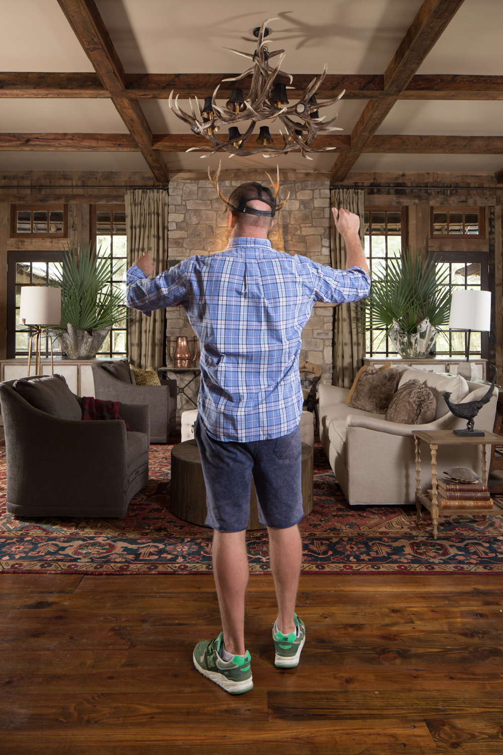
I had a little fun with Chris as he was orchestrating the shot!

I had a little fun with Chris as he was orchestrating the shot!

Final image. Space was left at the top and bottom to accommodate the logo and copy. This final image is a composite of 8 individual images 14 total layers in Photoshop for a 1.2GB file!

Final image. Space was left at the top and bottom to accommodate the logo and copy. This final image is a composite of 8 individual images 14 total layers in Photoshop for a 1.2GB file!
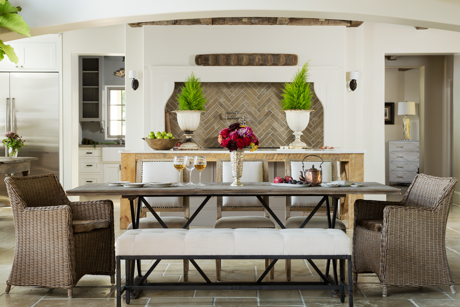
Gabby Catalog - Birmingham AL Interiors Photographer by Tommy Daspit

This shot is a blend of strobe and ambient light but mostly strobe. That allows me to more precisely control the color, shadow, and depth of light. Even with strobe the goal is to create an image that looks natural and truly represents the feel of t…

This shot is a blend of strobe and ambient light but mostly strobe. That allows me to more precisely control the color, shadow, and depth of light. Even with strobe the goal is to create an image that looks natural and truly represents the feel of the space.

A few months back I did a photoshoot for Gabby, the luxury indoor furniture line of Summer Classics. They wanted me to shoot their upcoming “Illuminate” catalog images. These weren’t the individual item shots done against a solid white background. Rather, these are what are called “Cadillac” shots and vignettes. I was to create the images that would show the furniture, lighting, and accessories in use and in a space. My job was to give the catalog viewer a better sense of how the items would come together in a real home. This is very similar to an interiors shoot that I might do for an interior decorator or designer. Now that the catalog is out I can share some of the images we created (see the catalog here).

For two days we took over the home owned by Jana and Danny McEachern of J&D Farms, in Gadsden. The Gabby team took out most of their furniture and replaced it with the catalog pieces. Each vignette was carefully crafted and staged by the amazingly talented Chris Hutchens, Gabby’s creative director. He really appreciated one of my favorite pieces of kit, my Camranger and iPad set up. Normally, the photographer gets the shot basically framed up and the designer goes back and forth to look through the camera as the shot is being arranged. Move a couch, go look through the lens, move it again, go look through the lens. On and on this goes. It can be a little less that ideal. With the Camranger I’m able to set the camera up, turn on live view, and hand an iPad to the designer. They can see in real time as they move things around, add and subtract props, and know exactly how the shot will look when put together. It has totally revolutionized the process. We can now get more shots in and the results are more inline with the artistic vision the creative team has!

I loved working with the entire Gabby team. The opportunity to collaborate with so many talented creative minds, with a great setting, and fantastic subject matter is amazing. It’s why I love what I do for a living so much! Be sure to check out the December issue of Veranda Magazine for a shot I did with Gabby for a full page Ad!

A capture from the catalog. It never gets old seeing a caption and page number along with your images! Again, this is a blend of strobe and ambient exposures. The chandelier was added from a separate image in post.

Chris is doing some finishing touches on the styling while I'm getting a color reference target shot. I'm triggering the camera from the iPad with the Camranger. The graycard I'm holding will be used in Lightroom to set the color temperature. That way the colors of the products are accurately represented in the final results. The chandelier was added in post on this image too.