Birmingham Skyline From Railroad Park - Architectural Photography by Tommy Daspit

Day to night transition of Birmingham Skyline. This is a combination of two images. One taken before sunset and one at night and blended together in Photoshop. Click on image to view larger.

A couple of weeks ago one of my best clients (Summit Renovation) wanted to know if I could do a time-lapse. They’re a roofing company and he wanted to show an old roof coming off and the new one going on over the course of a day. I told him that I’d never done one before but that I knew my equipment could do it, I just had to learn the technique. So I did some research and made a couple of trial runs (a couple of learning opportunities, i.e. failures). So now I think I have it down and it gave me an idea.

I’ve been wanting to do a night skyline shot of Birmingham for some time. I also really wanted to do a day to night transition in a single image. This gave me the perfect situation to do one more time-lapse run before the one for Summit. When Kelly told me we were sending the kids to the grandparents for the weekend I knew I this was the time. After checking the weather, I sold Kelly on the idea of spending our Saturday night shooting the city from Railroad Park (best vantage point with a pond in front where the city reflects). I said we could bring a blanket, some food, and make it into a picnic. How romantic! Fortunately she’s a great sport and was happy to go along.

We nearly aborted the mission when roads to the park were closed off for a Barrons game. Luckily we found a back way in and didn’t have to lug the gear too far. I’m so glad that we persevered. The weather, sky, and clouds, couldn’t have been more perfect for what I was going for. I think the end result was pretty good and it turned out to be a great date night to boot! 

My beautiful wife Kelly has been humoring my wild photography ideas for years. We had a great time making a nice date night out of the shoot. We had a picnic in the park while the kids were at Mimi and Pappa's. Quite the wild and crazy Saturday nigh…

My beautiful wife Kelly has been humoring my wild photography ideas for years. We had a great time making a nice date night out of the shoot. We had a picnic in the park while the kids were at Mimi and Pappa's. Quite the wild and crazy Saturday night!

I set my Canon 6D with Canon 24mm TS-E on a tripod and used the Camranger's Intervalometer to trigger the shutter on a schedule of one every 60 seconds. I used the iPad to monitor the progress. 

I set my Canon 6D with Canon 24mm TS-E on a tripod and used the Camranger's Intervalometer to trigger the shutter on a schedule of one every 60 seconds. I used the iPad to monitor the progress. 

This is a combination of two photos. One was taken before sunset. It's the main image. At that time all the lights were off in the buildings and the lamps were off in the park. I took a second image taken at night when all the lights were on and visible. I merged the two in photoshop to create the final image. Click on image to view larger.

Check out the final timelapse below.

Shot from Railroad Park, I used a Camranger to trigger the camera every 60 seconds from 6:00 pm to 8:30. I then used Adobe Premiere to create the timelapse from still images.

Interested in using any of these photos? Contact me for licensing information. See more of my Birmingham AL Architectural Photography portfolio.

Galleria Signs - Hoover, AL Architectural Photographer by Tommy Daspit

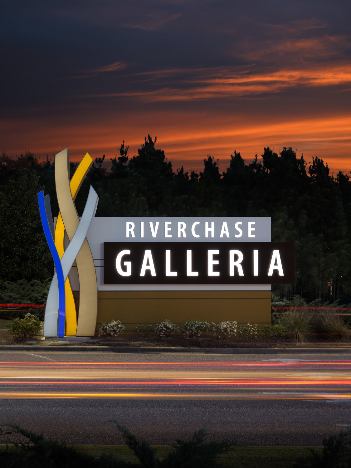
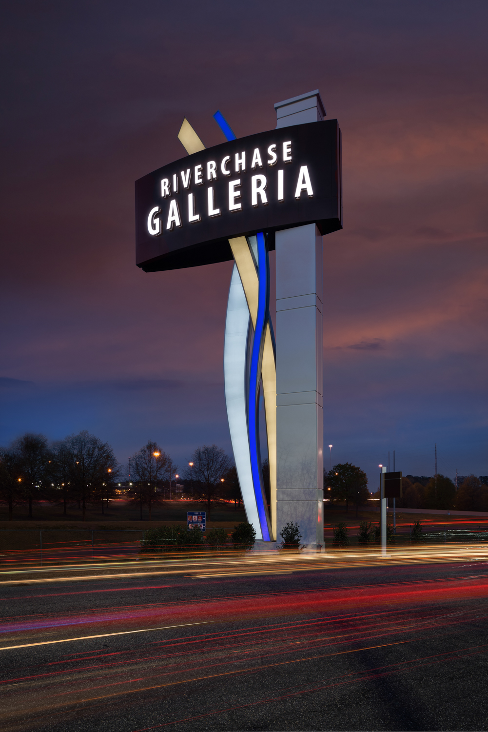
Galleria Hoover AL Architecectural Photographer

One of the things I love about being an architectural commercial photographer is the variety of projects I get to work on. It could be a kitchen for a remodeler one day and an apartment complex for a real estate developer the next. In this case I was contacted by Integrated Sign and Graphic in Lexington, Kentucky. They designed, built, and installed the new signs at the Riverchase Galleria Mall in Hoover. Daytime and twilight images of the exterior signs were needed. These photos would be used to showcase their work, to illustrate to potential clients what their capabilities were. It was my job to make sure that was done with the highest quality possible.

The mall is absolutely huge. There are many, many signs all around the property. Some face east, some west, some north, and some south. I had to plan my shots around the best time of day to get the best light on each sign. When it came to the night shots the window of opportunity for the best light with the illumination of the sign was very short. I had to make sure everything went right the first time as I could only do a maximum of two signs in an evening (it took two trips to get the ones they wanted).

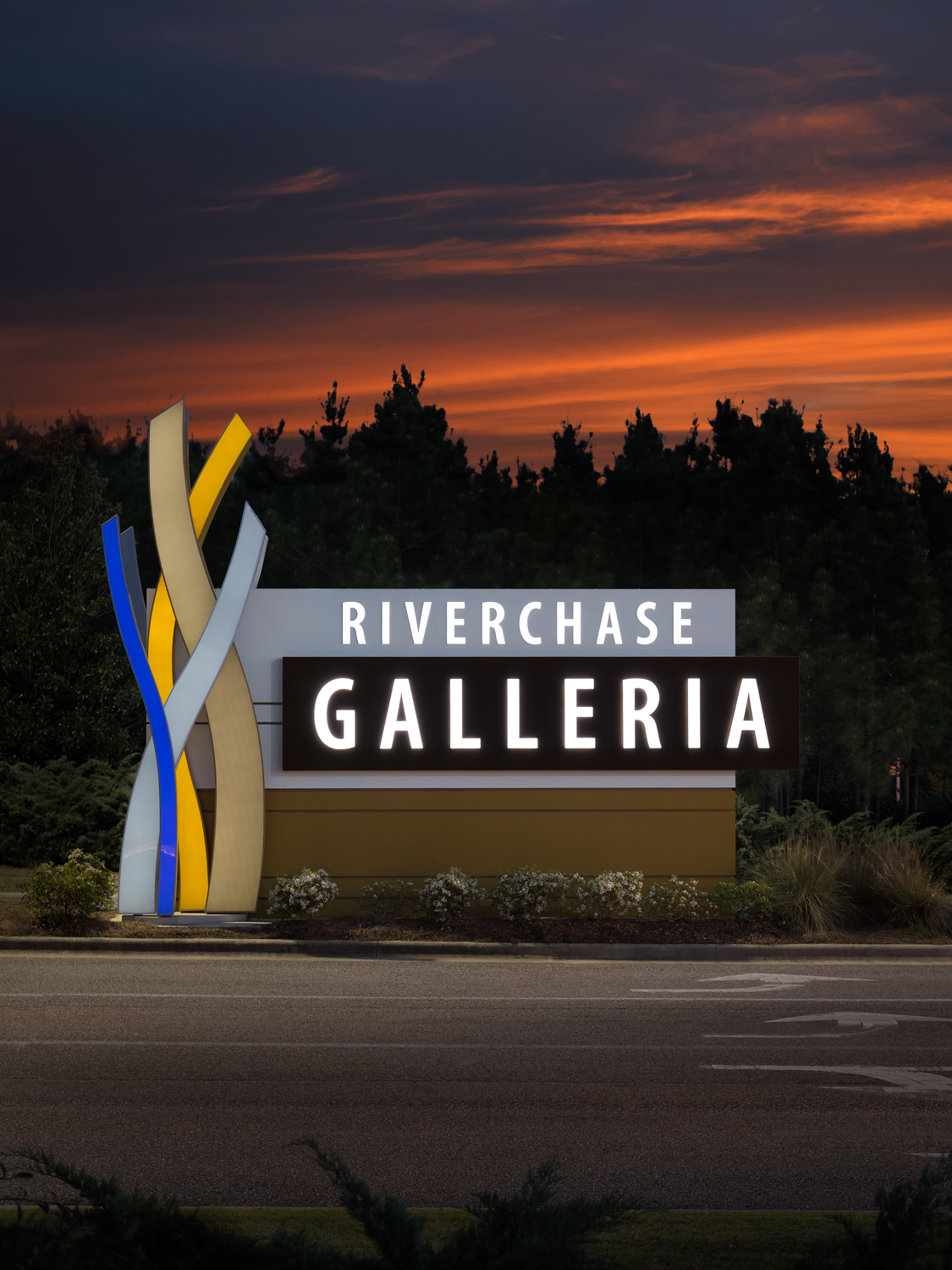
I also try to include elements in the environment that give the viewer a sense of the space and life going around the subject. To make that possible I included the cars going by the signs in both the day and nighttime images. I used slow shutter speeds to capture the movement and presence of the vehicles without taking away focus on the subject. This way the potential client has a better understanding of how the public sees and interacts with the sign. After all that’s what they are ultimately for. If it can’t get the attention of the public passing by then it’s of no benefit to the business that paid for it.

Drag the sliding line to see the difference with and without the lights from the cars in the image.

By including the intersection and the lights of the cars passing by, I'm able to give Integrated Sign's potential clients a better sense of the signs placement in the environment as well as the amount of traffic seeing that sign. A photo of just the sign would be perfectly fine. However, including energy, motion, and context gives the image more life and allows the end viewer to connect to the subject in a more meaningful way. This is one example of how I go above and beyond to serve the needs of my clients.

While a simple static shot of the sign by itself would have satisfied the basic needs of my client it wouldn’t have been the best use of their resources. By considering my clients end needs and purpose for the images I’m able to better create images that tell their story. Ultimately that is my job. I create images for my clients that are compelling and show their potential customers what they can do for them. I help my clients grow their businesses. I take as much pride in this as I do in creating the images that bear my name and my reputation. Take a look at the images below and tell me in the comments if you think I accomplished that mission.

click on thumbnail to view larger image

To see more of my commercial architectural photography see my commercial exteriors and commercial interiors portfolios.

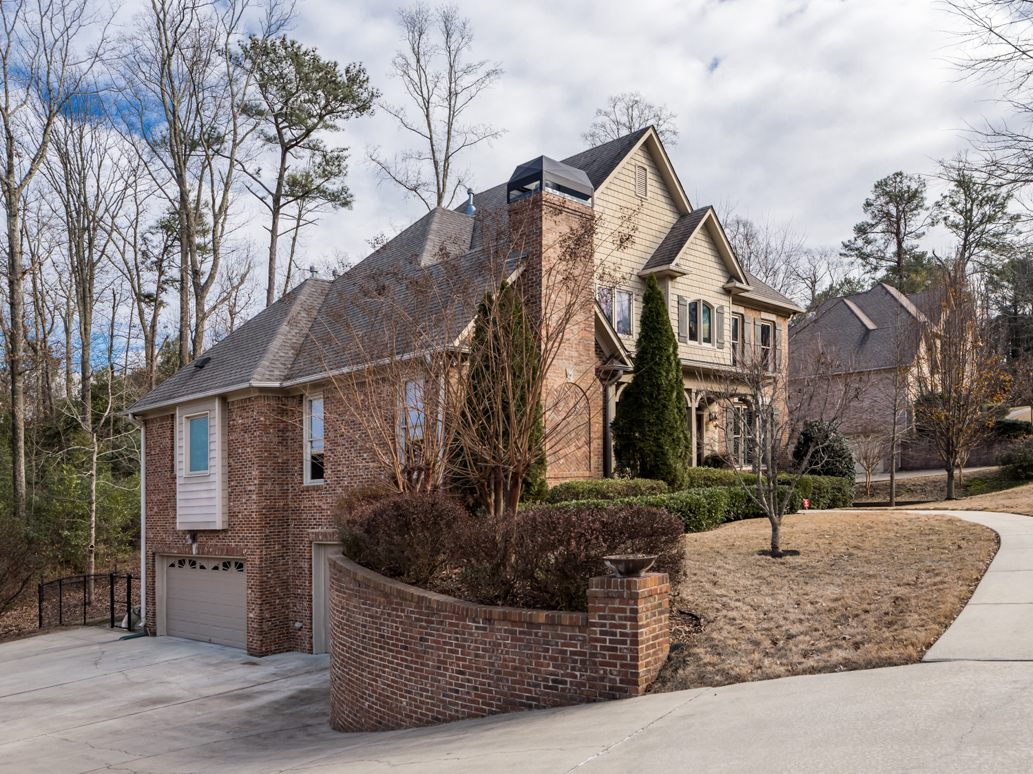
979 Cobble Creek - Birmingham AL Real Estate Photography by Tommy Daspit

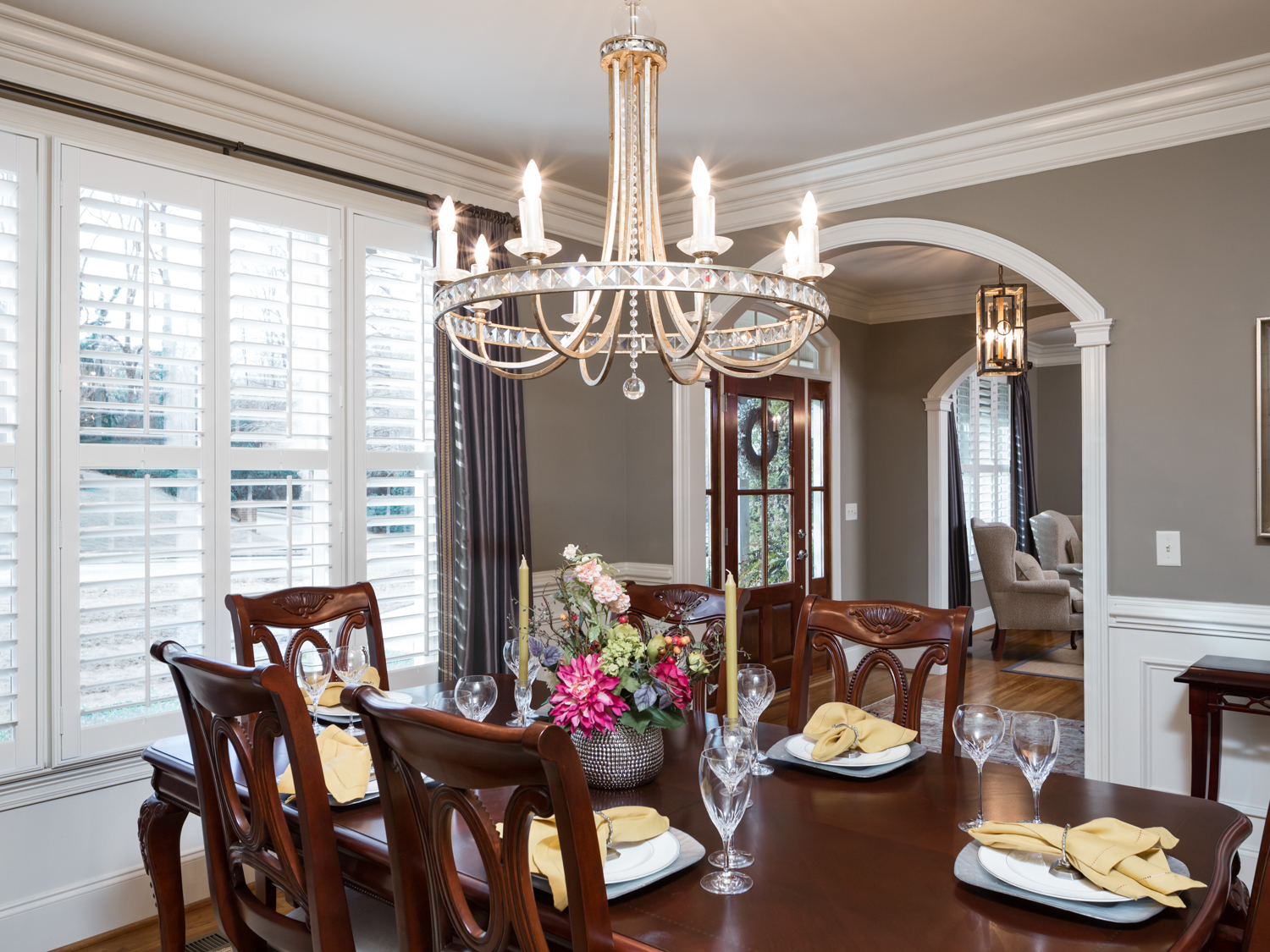
A rather large amount of my real estate photography business does not come from agents. Instead, it comes from the homeowners themselves. Often they aren’t satisfied with the photos the agents take themselves or ones taken by a photographer that works more on volume (I take much longer to photograph a home than most real estate photographers). The homeowner recognizes the importance of great photos to attract potential buyers. The homeowner is the one with the greatest stake in selling the home. I’ve had more than one homeowner tell me that they could recognize my style. That they could tell which homes I’d photographed!

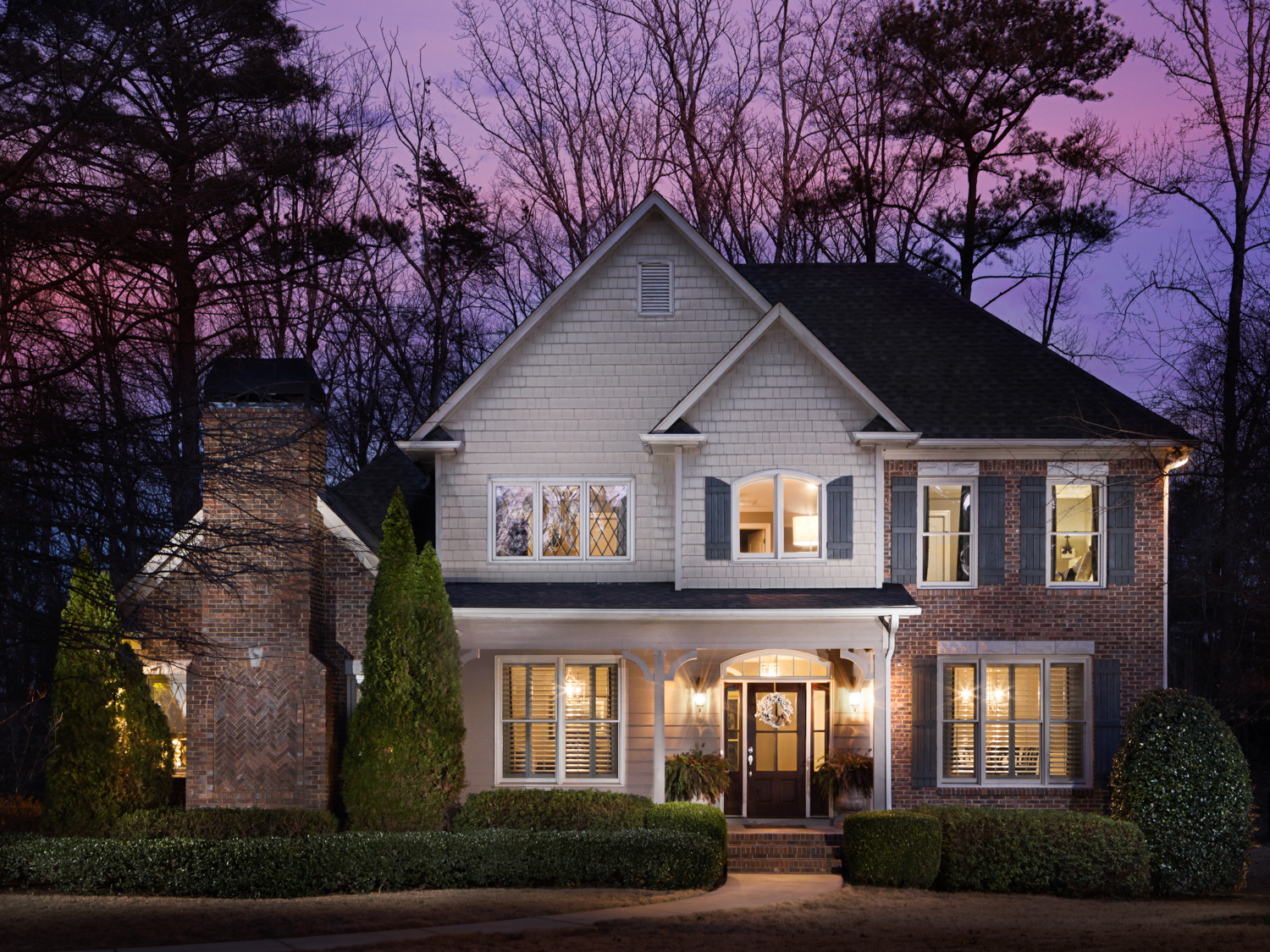
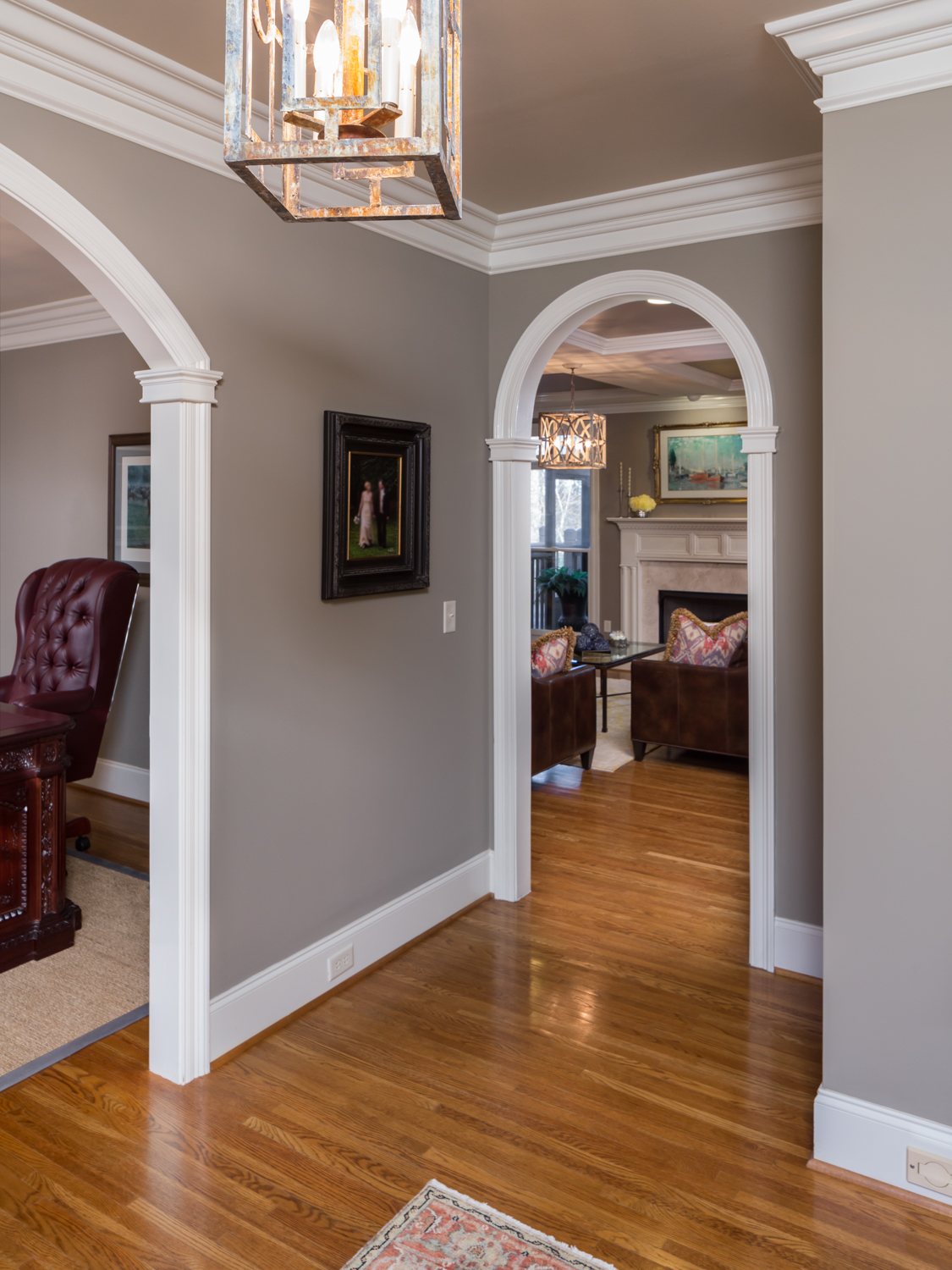
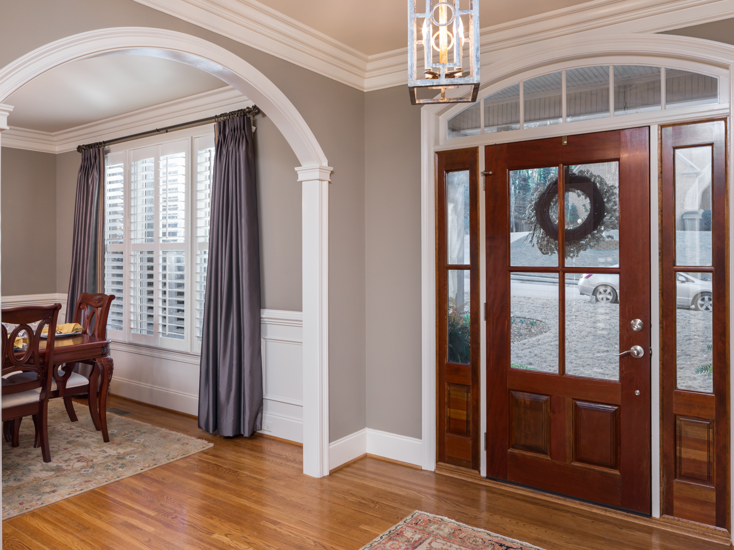
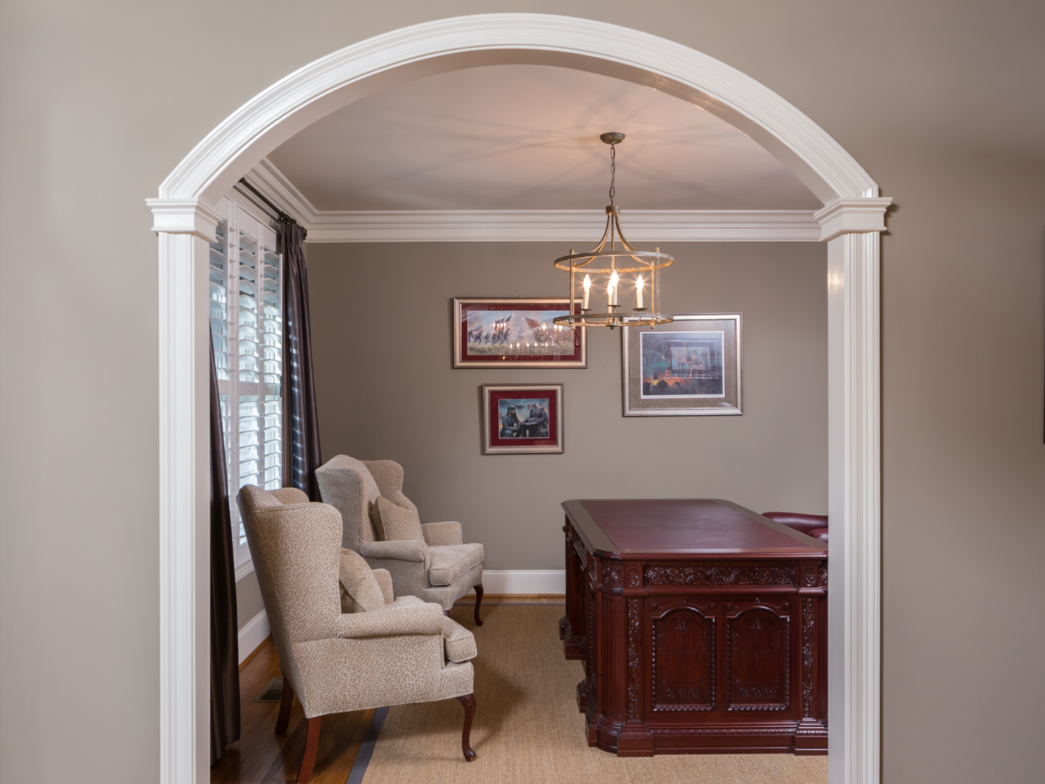
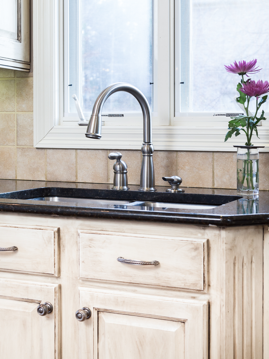
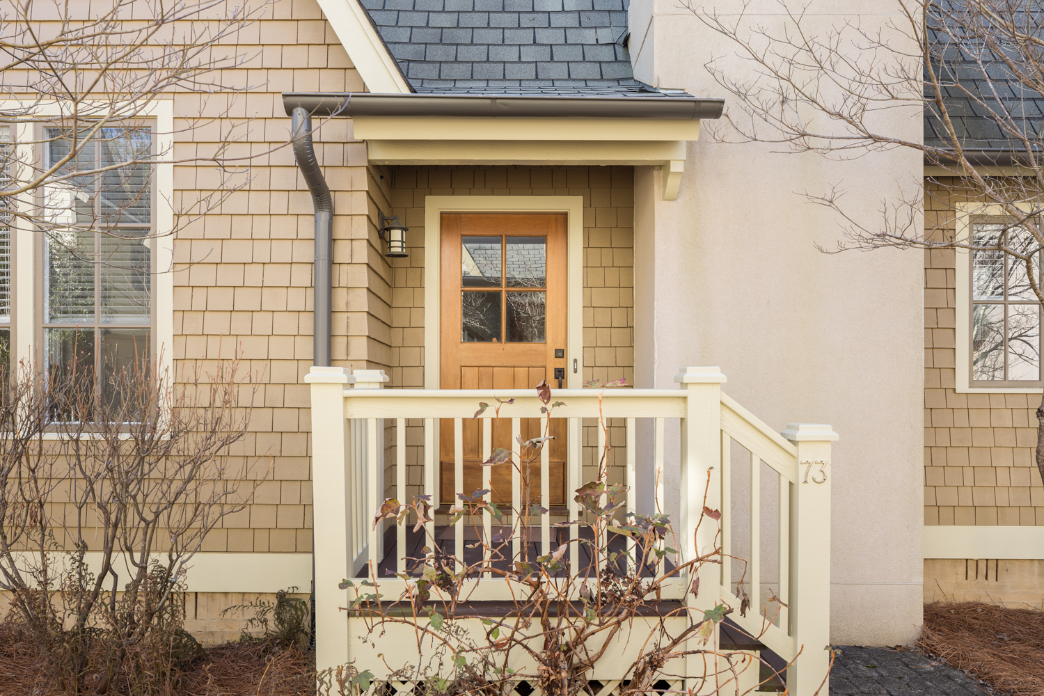
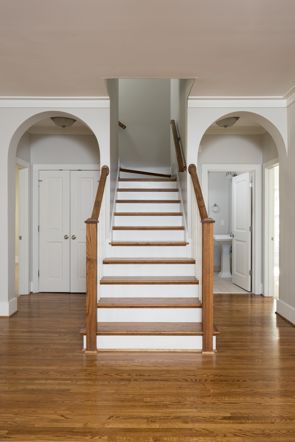
In the case of this beautiful home in Hoover the homeowners knew they wanted the house professionally photographed before they even hired an agent to list it. They found me online and we picked the perfect day and time for the sunlight to be just right. I could tell right away that this couple had taken a lot of pride in maintaining this home. No detail was left unattended to. They even went so far as to stage the kitchen, livingroom, and dining room to help the photos look even better. I will say that this was a first!

I love working with people who understand that it takes more than just a “nice camera” to get great images. They were patient with me as I lit each room and composed each shot. There were little details that take a little extra time for me but can make a big difference in the final image. For example, the homeowner told me how she was disappointed that the ferns by the front door had died. We’d just had a big cold snap and they didn’t make it. She lamented how brown and dead looking they were. So in the image of the front porch I used the magic of Photoshop to bring them back to life. It took me a few extra minutes at the computer but it was worth it. The photo looked much better and the client was thrilled! In fact here’s what they had to say:

Tommy:  The photos look FANTASTIC.....we absolutely love them. Nice touch up job on the ferns at the front door!  GREAT JOB!!” and “If these photos don't get us showings, I don't know what will.”

Take a look at the photos below and go here to get more information on this property, or contact the agent, Cindy Porter 205-755-7719.

click on thumbnail to view larger image

Walgreens - Birmingham AL Commercial Photographer by Tommy Daspit

Tommy Daspit is an architectural photographer in Birmingham AL

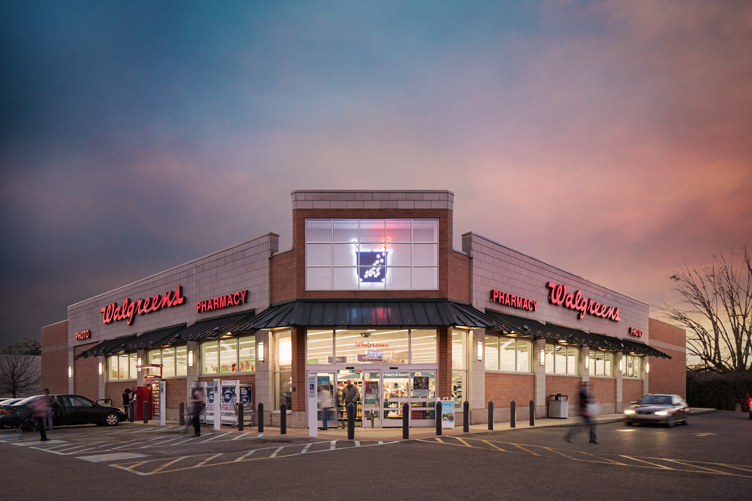
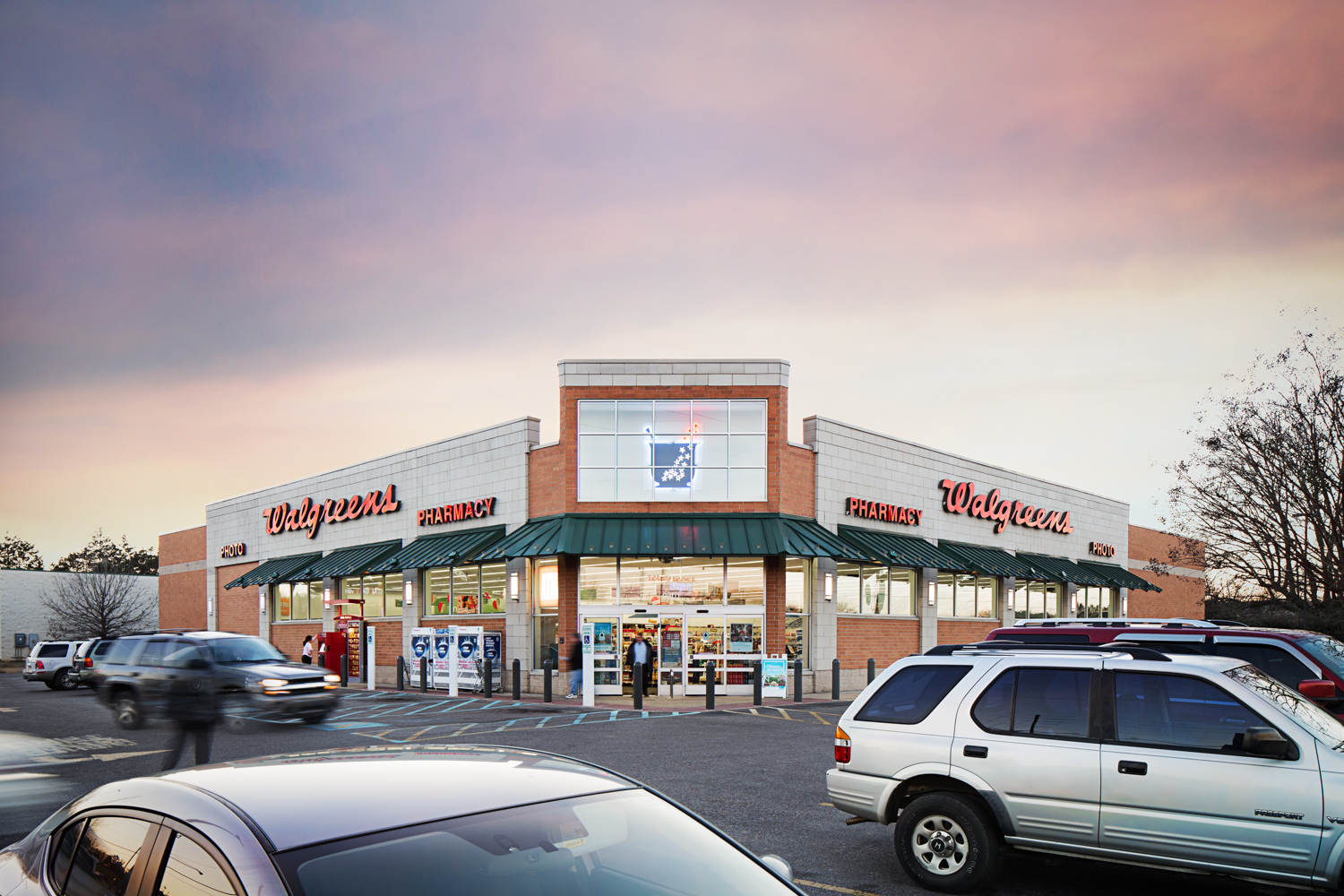
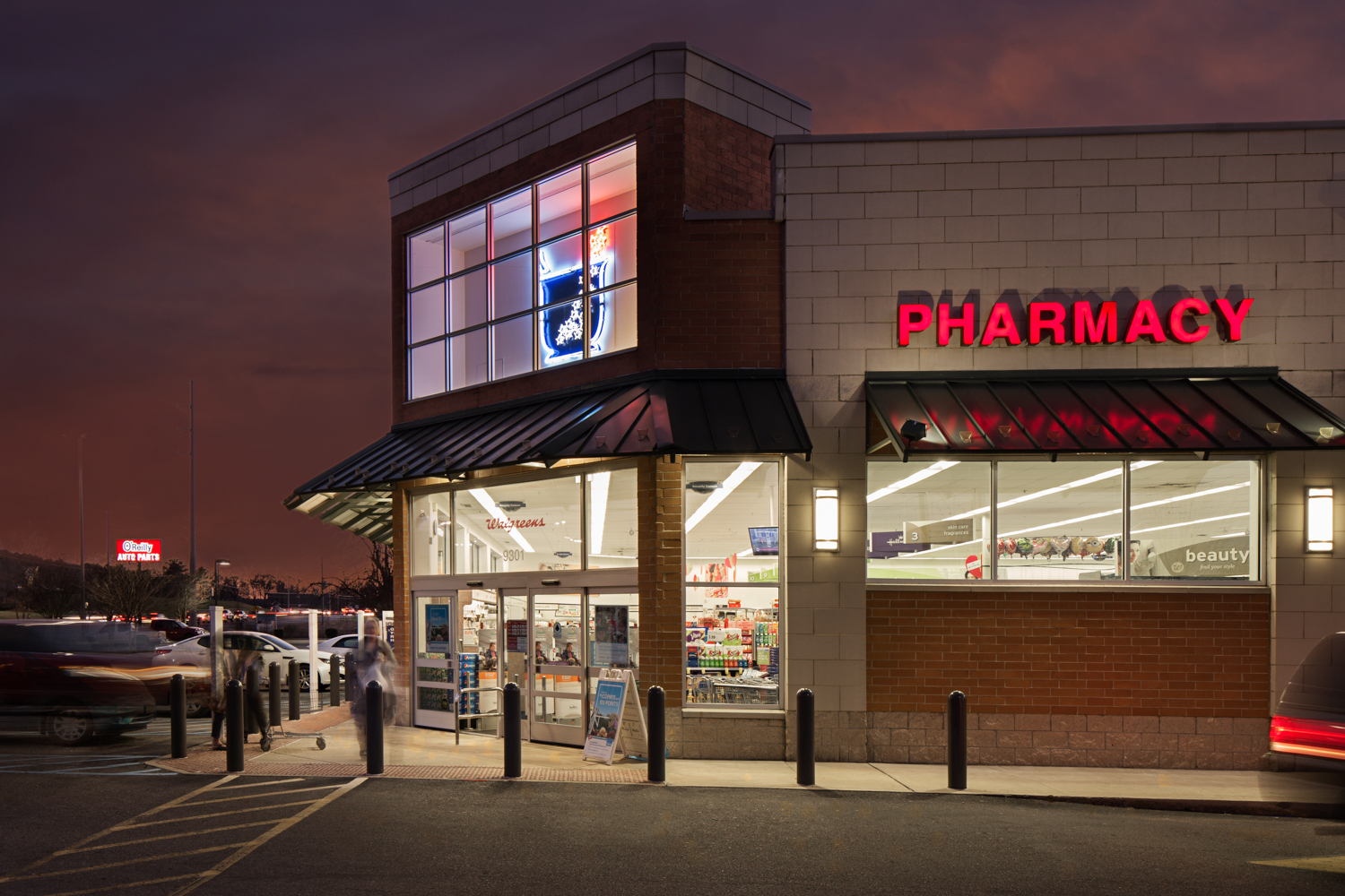
A couple of weeks ago I was contacted by a commercial real estate firm out of New York. They needed photos of a Walgreens in Alabaster. The images needed to be colorful, eye catching, and at the same time, demonstrate the customer traffic of this location. Of course I was up for the challenge!

I started the shoot in what photographers call the “golden hour”. This is the hour just before sunset and just after sunrise each day. So long as it’s not overcast this is often considered to be the best time of day for photography. The light is “warm”, hence the golden hour name, and the angle of the light is good for nice shadows and contrast. I continued taking multiple exposures as the light changed over the next hour and a half.

One of the challenges was to show the customers coming in and out of the store and cars in the parking lot. This is especially tricky when you’re not using models, but rather normal people going about their lives. If they’re recognizable in the image, and you’re using it for advertising, then you have to have them sign a model release form. This isn’t something we wanted to deal with so a technical solution was needed. I could just blur them in Photoshop but you end up with a photo that looks like it was shot by 60 minutes interviewing a mob informant. Not a good look. Instead, I set the camera to have long shutter speeds. This still showed people and cars there but they were motion blurred. This has the benefit of not only hiding their identity but also conveying motion and energy of the space.

The final images were actually a composite of many photos. I overlayed people and cars from multiple images to create the final vision. The sky was added from a library of skies to fit every possible lighting situation (if you wait for the sky to be perfect as you shoot the project you will be doing a LOT of waiting).

The end result was an image that showed the details of the building, customers patronizing the business, and colors that grab the viewer’s attention. I was able to check off all the boxes my client needed and they were thrilled with the results. Amazing commercial real estate photos aren’t taken, they are created.


click on thumbnail to view larger image

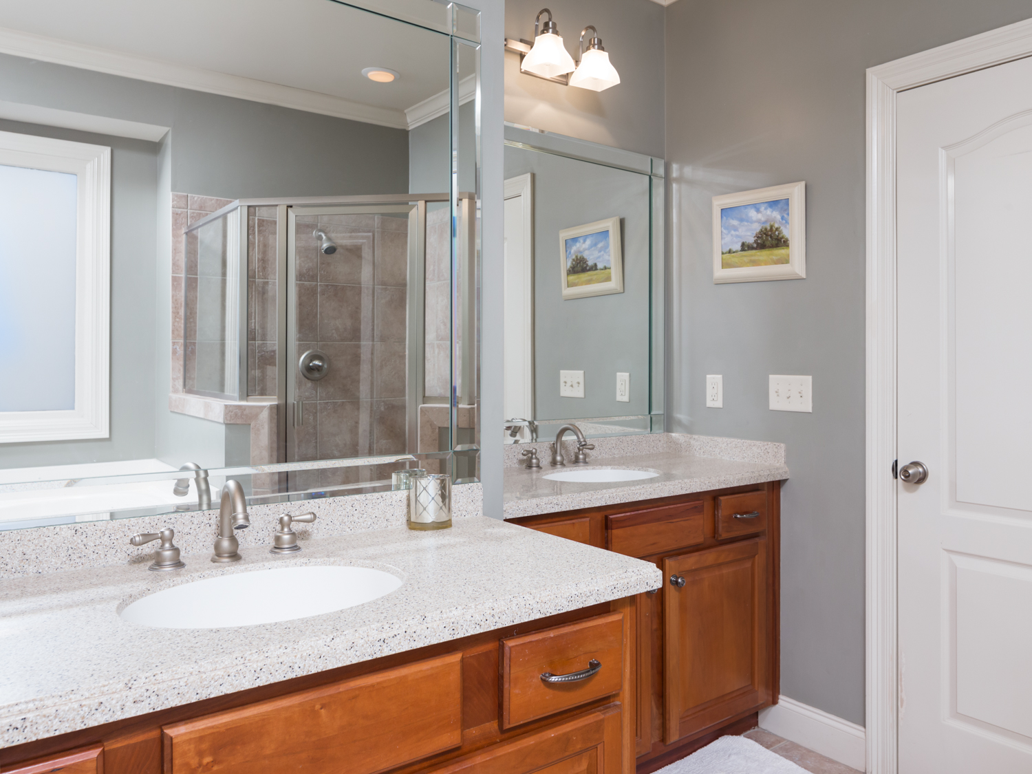
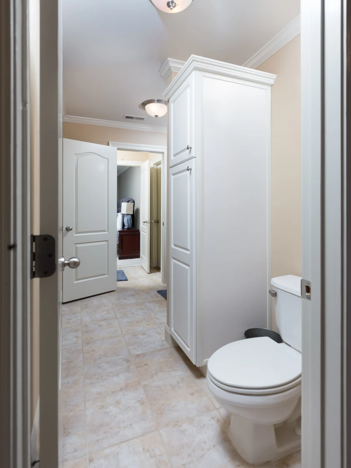
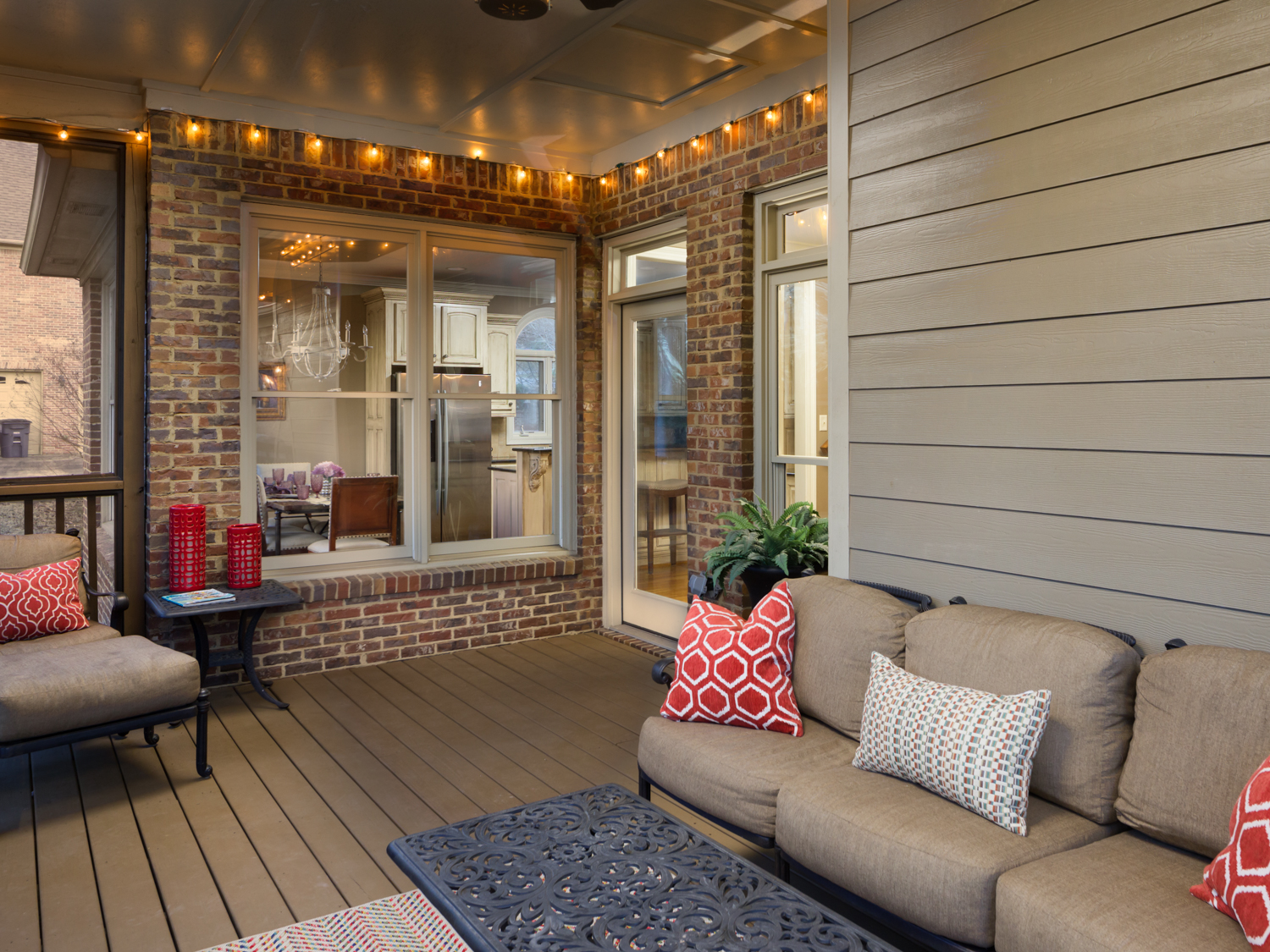
Rudulph Rents - Birmingham AL Real Estate Photographer by Tommy Daspit

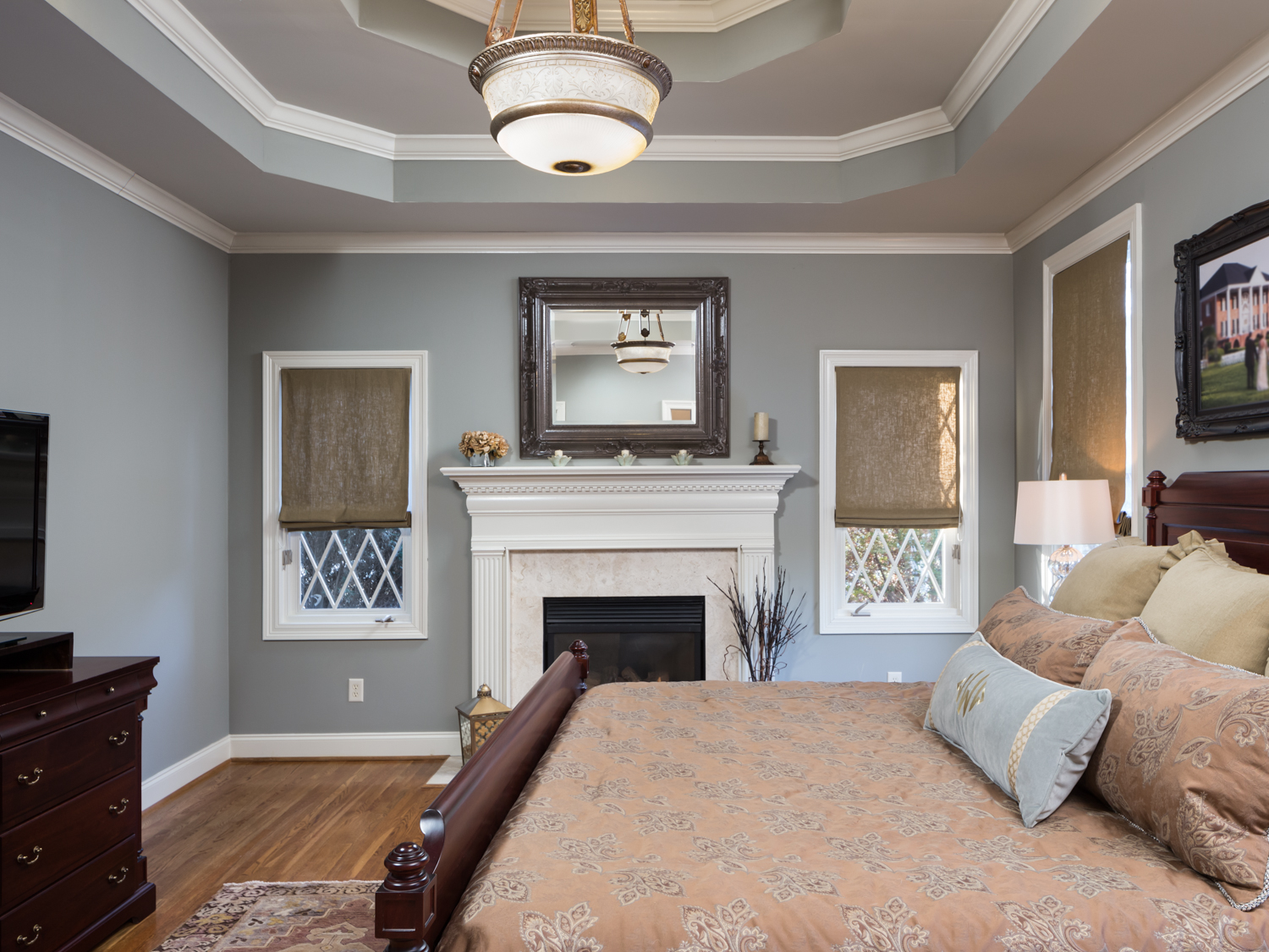
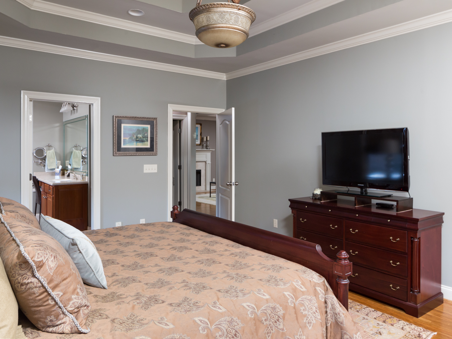
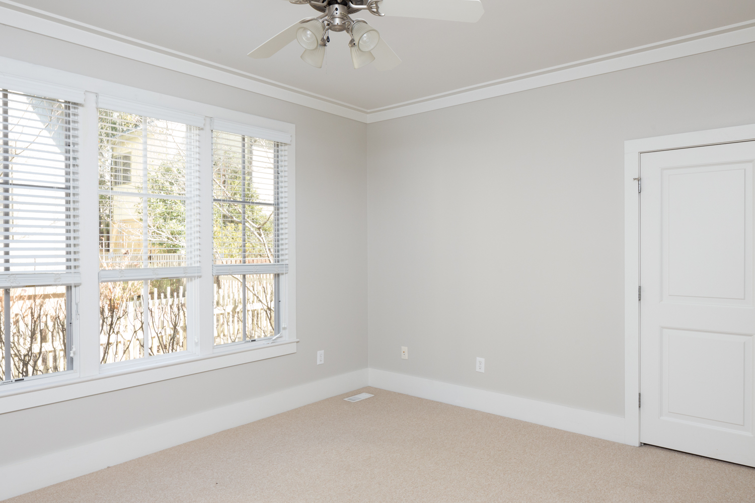
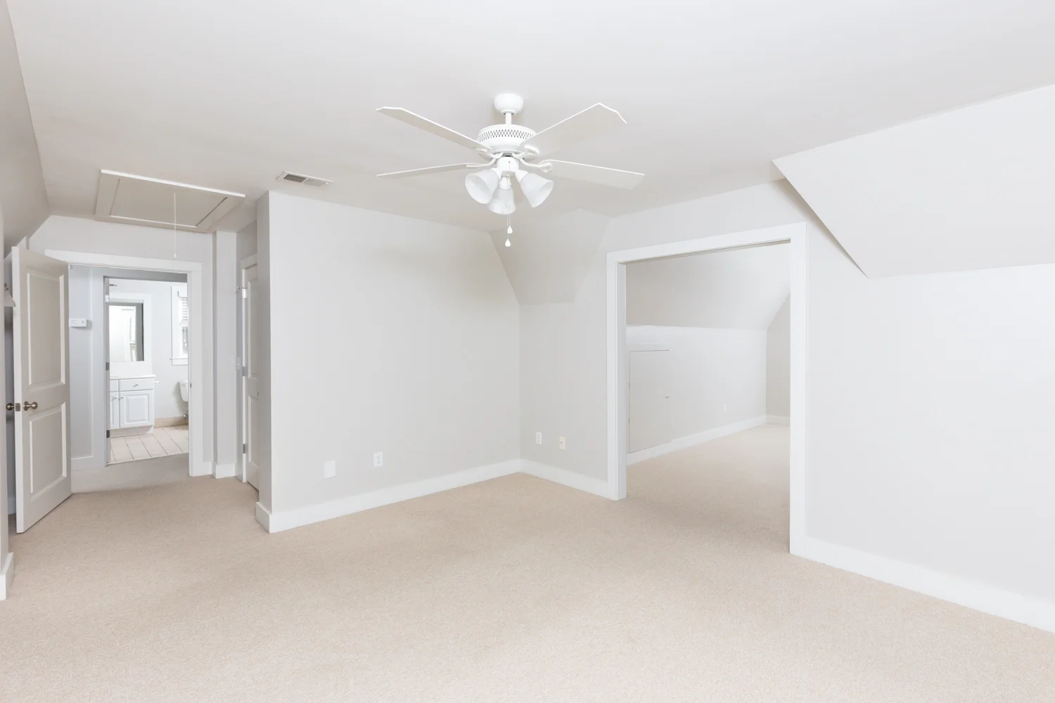
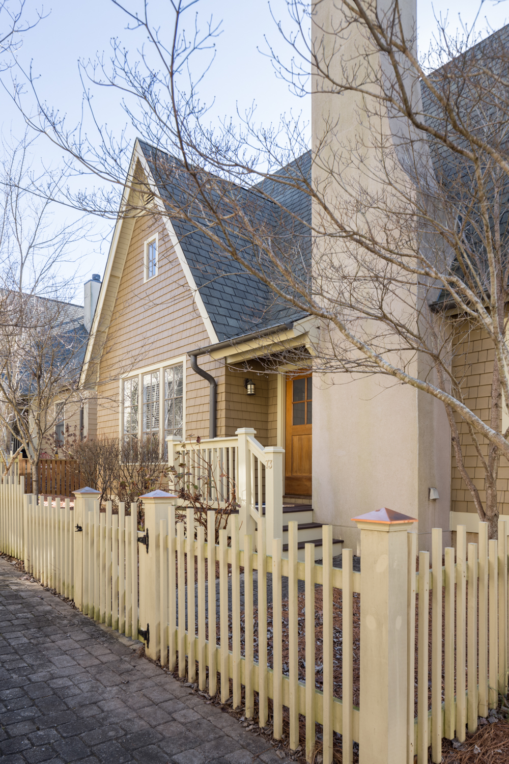
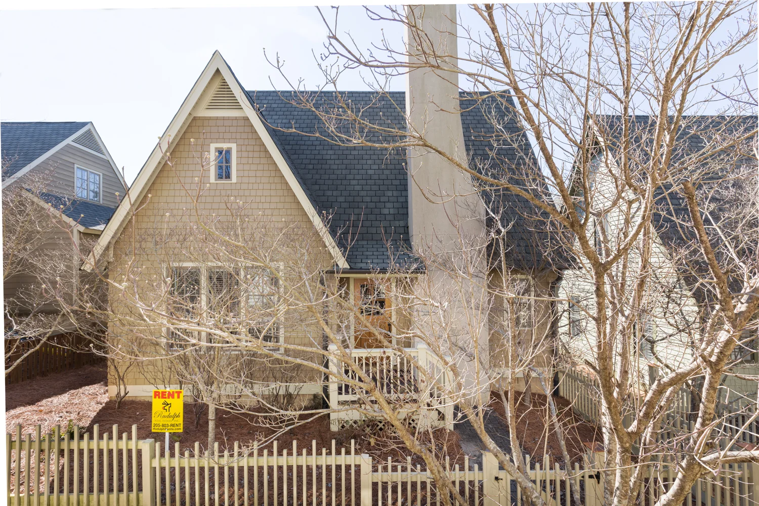
I’ve photographed many homes for real estate agents and homeowners to help sell the property. This was the first time I’ve been hired to photograph a house for rent. Rudy Rudulph, owner of Rudulph Rents here in Birmingham gave me a call. Normally he photographs his listings himself. In this case the homeowner he was representing wanted it professionally photographed. It’s a very nice home and the photos needed to reflect that. So I was honored to be entrusted with that responsibility!

The truth of the matter is that whether you are selling a home or marketing it for rental, the photographs are what make people take notice. High quality images will make the listing stand out from the crowd. People flipping through listings on their phone or laptop make decisions about which one to look at deeper in milliseconds. A bad photo can give a bad feeling about the home even if it’s amazing in person. They may never give it that chance.
 

Earlier in the week I was photographing a home coming onto the market and talking to the homeowner (as I often do, I’m kind of an extrovert). They told me that they almost didn’t look at the home they ultimately purchased (the one they are now selling). The photos were awful. It was a real turn off and they really had no interest in the home. Fortunately for the seller, it was the only home then available in the area they wanted and in person it looked much better than the photos. They got a great deal on the home because it had been on the market so long that the price had been reduced. How many potential buyers never gave the house a chance because of the bad first impression the photos gave?

They say you never get a second chance to make a first impression. The photos of the home, whether for sale or rent, are what make that first impression. My job it to make sure it’s a good one!

Learn more about this property here.

click on thumbnail for larger image

view these photos as a video slideshow