Retail

Galleria Signs - Hoover, AL Architectural Photographer by Tommy Daspit

Galleria Hoover AL Architecectural Photographer

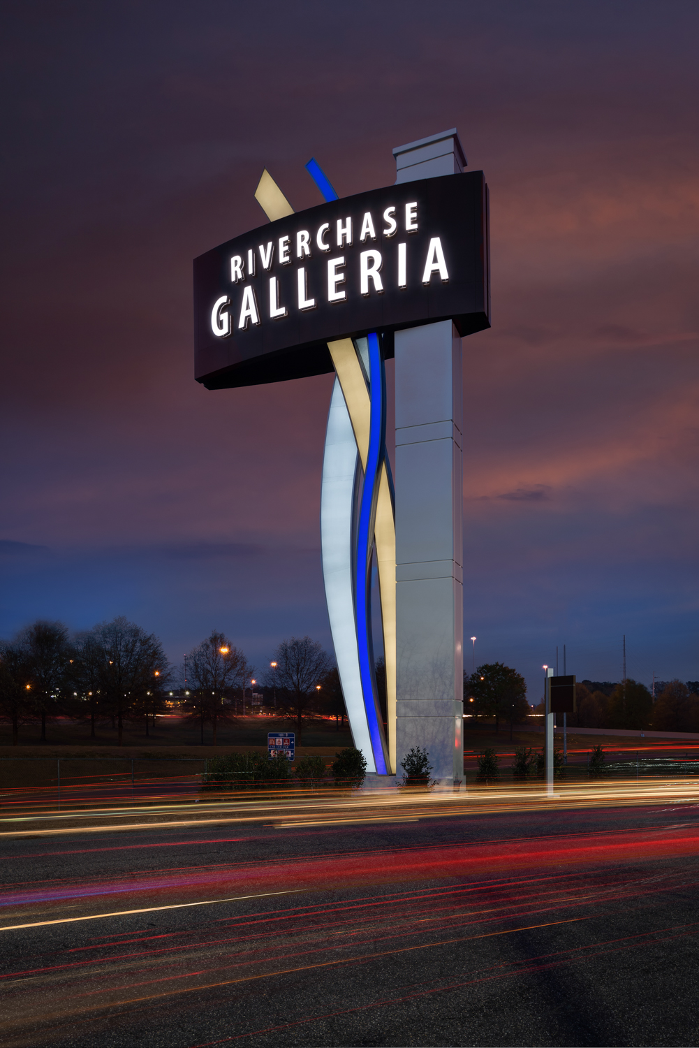
One of the things I love about being an architectural commercial photographer is the variety of projects I get to work on. It could be a kitchen for a remodeler one day and an apartment complex for a real estate developer the next. In this case I was contacted by Integrated Sign and Graphic in Lexington, Kentucky. They designed, built, and installed the new signs at the Riverchase Galleria Mall in Hoover. Daytime and twilight images of the exterior signs were needed. These photos would be used to showcase their work, to illustrate to potential clients what their capabilities were. It was my job to make sure that was done with the highest quality possible.

The mall is absolutely huge. There are many, many signs all around the property. Some face east, some west, some north, and some south. I had to plan my shots around the best time of day to get the best light on each sign. When it came to the night shots the window of opportunity for the best light with the illumination of the sign was very short. I had to make sure everything went right the first time as I could only do a maximum of two signs in an evening (it took two trips to get the ones they wanted).

I also try to include elements in the environment that give the viewer a sense of the space and life going around the subject. To make that possible I included the cars going by the signs in both the day and nighttime images. I used slow shutter speeds to capture the movement and presence of the vehicles without taking away focus on the subject. This way the potential client has a better understanding of how the public sees and interacts with the sign. After all that’s what they are ultimately for. If it can’t get the attention of the public passing by then it’s of no benefit to the business that paid for it.

Drag the sliding line to see the difference with and without the lights from the cars in the image.
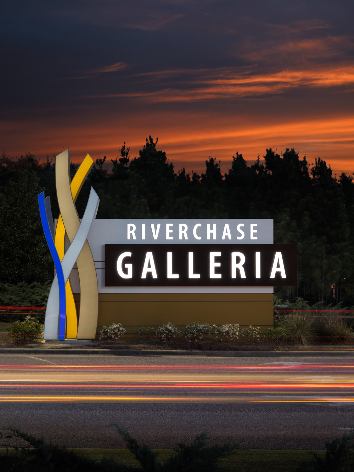
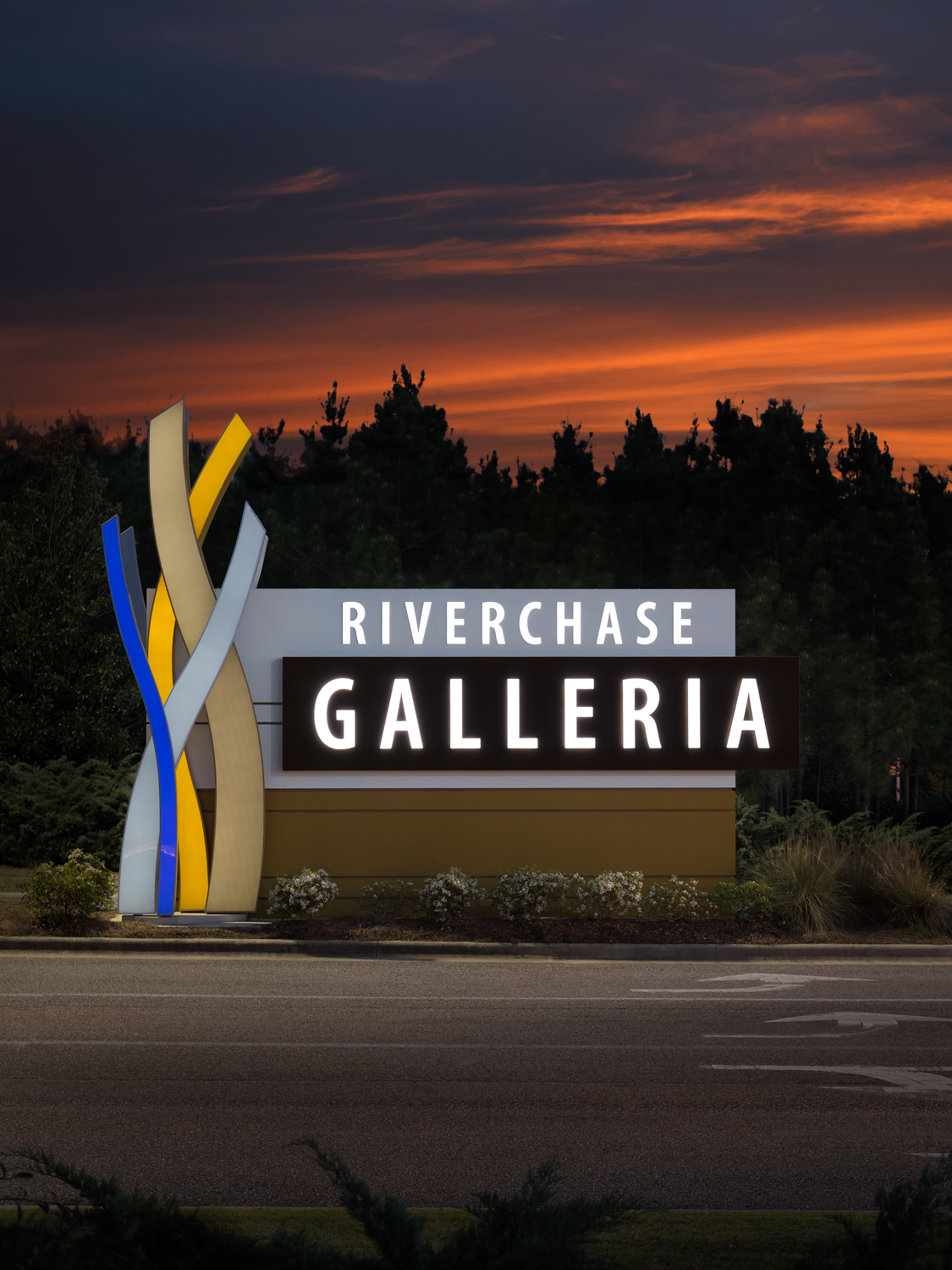
By including the intersection and the lights of the cars passing by, I'm able to give Integrated Sign's potential clients a better sense of the signs placement in the environment as well as the amount of traffic seeing that sign. A photo of just the sign would be perfectly fine. However, including energy, motion, and context gives the image more life and allows the end viewer to connect to the subject in a more meaningful way. This is one example of how I go above and beyond to serve the needs of my clients.

While a simple static shot of the sign by itself would have satisfied the basic needs of my client it wouldn’t have been the best use of their resources. By considering my clients end needs and purpose for the images I’m able to better create images that tell their story. Ultimately that is my job. I create images for my clients that are compelling and show their potential customers what they can do for them. I help my clients grow their businesses. I take as much pride in this as I do in creating the images that bear my name and my reputation. Take a look at the images below and tell me in the comments if you think I accomplished that mission.

click on thumbnail to view larger image

To see more of my commercial architectural photography see my commercial exteriors and commercial interiors portfolios.

Walgreens - Birmingham AL Commercial Photographer by Tommy Daspit

Tommy Daspit is an architectural photographer in Birmingham AL

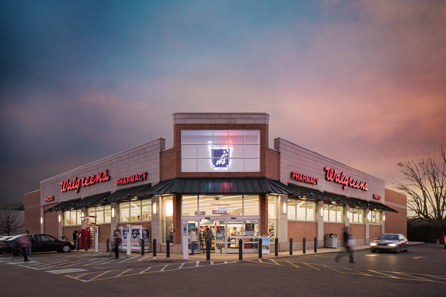
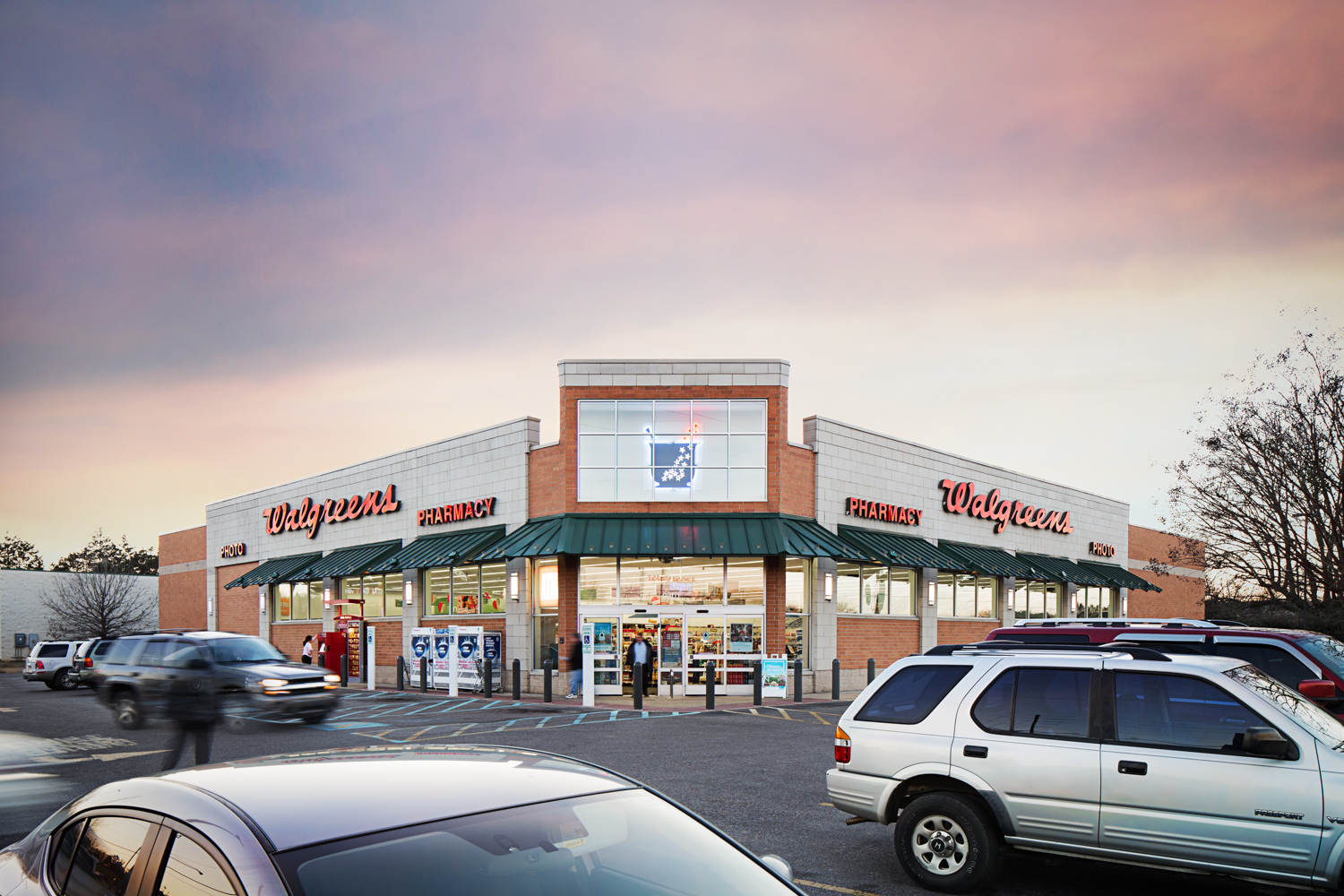
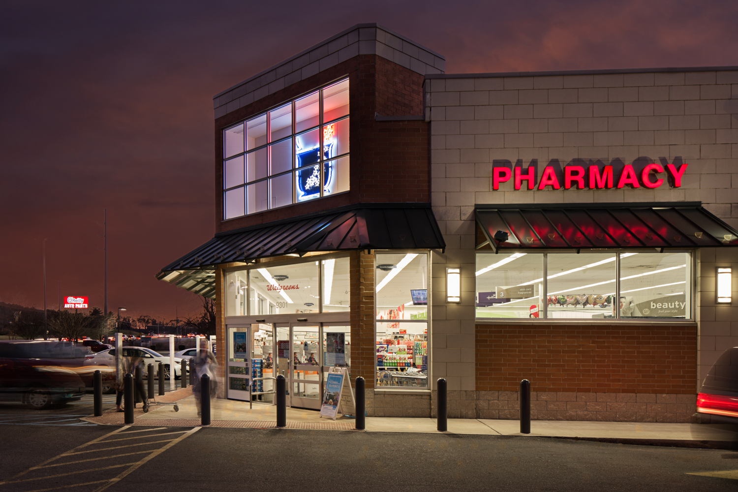
A couple of weeks ago I was contacted by a commercial real estate firm out of New York. They needed photos of a Walgreens in Alabaster. The images needed to be colorful, eye catching, and at the same time, demonstrate the customer traffic of this location. Of course I was up for the challenge!

I started the shoot in what photographers call the “golden hour”. This is the hour just before sunset and just after sunrise each day. So long as it’s not overcast this is often considered to be the best time of day for photography. The light is “warm”, hence the golden hour name, and the angle of the light is good for nice shadows and contrast. I continued taking multiple exposures as the light changed over the next hour and a half.

One of the challenges was to show the customers coming in and out of the store and cars in the parking lot. This is especially tricky when you’re not using models, but rather normal people going about their lives. If they’re recognizable in the image, and you’re using it for advertising, then you have to have them sign a model release form. This isn’t something we wanted to deal with so a technical solution was needed. I could just blur them in Photoshop but you end up with a photo that looks like it was shot by 60 minutes interviewing a mob informant. Not a good look. Instead, I set the camera to have long shutter speeds. This still showed people and cars there but they were motion blurred. This has the benefit of not only hiding their identity but also conveying motion and energy of the space.

The final images were actually a composite of many photos. I overlayed people and cars from multiple images to create the final vision. The sky was added from a library of skies to fit every possible lighting situation (if you wait for the sky to be perfect as you shoot the project you will be doing a LOT of waiting).

The end result was an image that showed the details of the building, customers patronizing the business, and colors that grab the viewer’s attention. I was able to check off all the boxes my client needed and they were thrilled with the results. Amazing commercial real estate photos aren’t taken, they are created.


click on thumbnail to view larger image

Scandinavian Furniture & Design - Birmingham AL Commercial Photographer by Tommy Daspit

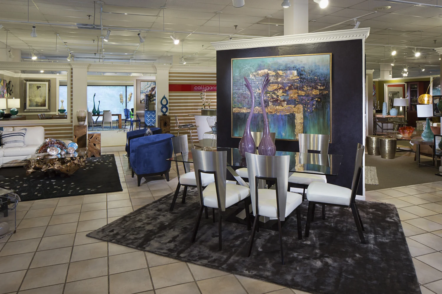
As I’ve mentioned before, referrals are the life blood of my business. I’m honored when a client is so thrilled with the results of my work that they recommend me to their own clients, friends, and family. This is an especially high honor when the referral is coming from a fellow photographer. That was the case with this shoot. Alanna Rose, a senior portrait and commercial head shot specialist, shares a building with Scandinavian Design Gallery a furniture store in Hoover. She recently expanded her senior portrait work (she is contracted by Hoover High School for all of their photos) and wanted to make here incoming clients feel more comfortable and find the studio more easily. So she had me do a Google virtual tour of the space. She was so happy with the results that she sent me over to see Theresa at Scandinavian Design! 

I will confess that there is an added level of pressure to make sure everything is perfect when you know another photographer will be scrutinizing the result. This was true when I did her studio and was true again when I photographed the furniture showroom. Not that I ever “slack off” when doing any shoot. I’m nothing if not a perfectionist and strive to always improve my work and do the best job for each and every client. There is just a little more anxiety when you know the results are going to be looked at that more closely!

So here are the end results. I created the Google tour and conventional commercial photos of the showroom. I did a little extra thing as well… You can see below a quick behind the scenes video. My process is a little unique in comparison to many other photographers. The conventional still photos are actually a composite of many individual photos. I will “light paint” the scene with a strobe. The end result is something that would be difficult to achieve in a single image. See for yourself by checking out the quick timelapse video of the process!

click and drag to navigate virtual tour

click on thumbnail to view larger image

Check out this quick YouTube video I created showing a little behind the scenes on how this shoot was done.

http://tommydaspit.com Timelapse video showing me light painting a furniture store showroom. Shot with a Canon 6D, Canon 24mm f3.5L TS-E, Yongnuo YN-560IV, monopod, and iPad. I triggered camera remotely with iPad. Flash controlled wirelessly as well.

Bromberg's & Co at The Summit - Birmingham AL Commercial Photography by Tommy Daspit

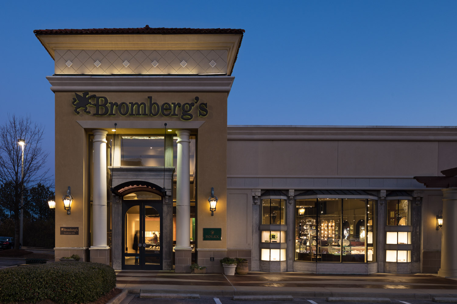
I returned near sunset to create this "blue hour" image. It's actually a composite of 11 separate  exposures. Overall it took about two hours (in the freezing cold) to get this one shot. I really like the blurred people inside. This helps …

I returned near sunset to create this "blue hour" image. It's actually a composite of 11 separate  exposures. Overall it took about two hours (in the freezing cold) to get this one shot. I really like the blurred people inside. This helps show that the business is vibrant and not just a building. 

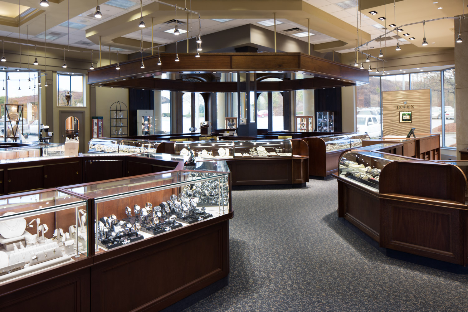
Last week I had the great fun and challenge of creating a Google Maps Business View 360º virtual tour of Bromberg & Co at the Summit here in Birmingham. 

I say it was a challenge for a couple of reasons. First, there’s glass and mirrors EVERYWHERE. This makes it fun making sure that the camera and myself are positioned so we don’t appear in any of the photos. This is where the wireless triggering of my camera with an iPad is so valuable. There are many times where I’m hiding around a corner. Very often this is the only way to keep me out of the image. Then there are my lights. For the conventional still images there are multiple light sources involved. Making sure reflections from the lights don’t come up in the mirrors and glass takes a lot of geometry (thought I was done with that in High School), understanding how light interacts with various surfaces, and a lot of trial and error.

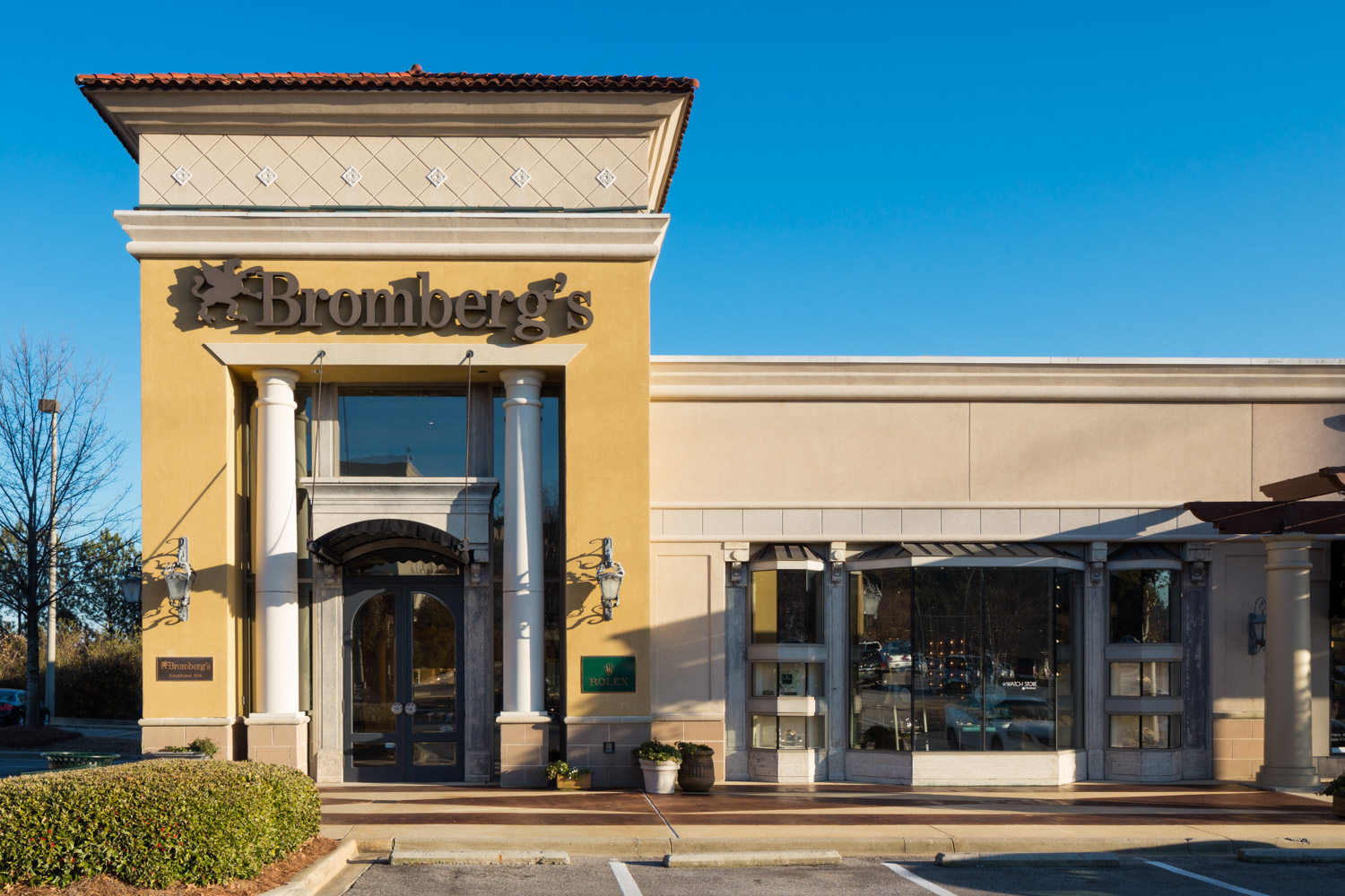
Second, we wanted to create a “blue hour” exterior of the store (check out this post to learn more). I love doing these. There is simply no better way to make a building look beautiful and really capture the viewers attention than with a blue hour image. These are actually multiple photos taken at different times (just before and after sunset), and with multiple strobe exposures. They take patience, time, and skill to pull off. One blue hour photo can take two hours to complete. That’s just the in camera part. Once back at the office it’s time to composite all those photos. Using photoshop, and a graphics tablet, it can take several hours at the computer to get it all right. The results can be truly spectacular and I think worth the effort!

I’m also very excited because these photos and virtual tour are going into the new website being created for Bromberg’s by Vehicle Media. I’ve worked with Vehicle Media on several projects before Just this last week they won an ADDY for our joint project for the Sonnet House! I know that they will do an amazing job incorporating the tour and photos into the site design.

Take a look at the virtual tour and photos below. To learn more about Bromberg & Co check out their Google + Local page.

click and drag to pan, click arrows to move to next panorama

click on thumbnail to view larger image

Learn more about the Google Maps Business View Program here. Have a business that could benefit from a Google tour or high quality commercial photography? Contact me today to see how I can help you stand out from your competition.