Evening

Helena High School Architectural Photography by nikonic1976@yahoo.com

When Kelly and I chose to move to Helena a little over four years ago, one of the main reasons we chose this town was the schools. We love the rest of the town (old town, Buck Creek, the waterfall, parks, community), but the reputation and quality of the schools was one of the most important factors. So we were very excited when the plans for a new High School were announced. Helena students had been sharing a high school with nearby Pelham. Now we would have a place of our own.

Even before completion you could really tell the new feeling of pride in the community. From the selection of the mascot and logo design, to frequent construction updates from famous town blogger No Sleep in Helena, the excitement grew for its completion.

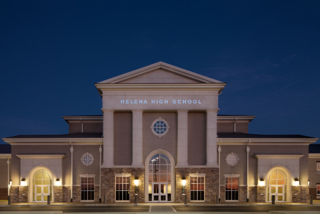
As an architectural photographer I was really excited by the striking design of the building. It’s impressive inside and out. Sitting upon one of the highest hills in Helena it’s reminiscent of the Roman Pantheon, which seems to have inspired part of the design. The front of the school faces almost due west. This, combined with a lack of surrounding clutter, makes for an architectural photographers dream. I knew that their would be opportunities for amazing light and some amazing images.

Over the Christmas break I finally got an opportunity, with some great light, to go out and do some shooting. As the images show, my expectations we clearly met! The only challenge was the presence of the flag pole and parking signs in front. Even with the use of a Tilt-Shift lens (specialty lens for architectural photography), there was no way to capture the full front without them. I know that the architect who designed the school wouldn’t want them obscuring their work. So I had three options, one I could photograph the front from the side, or two use a super wide angle lens, or three, remove them in Photoshop.

Option one wasn’t ideal because it really wouldn’t show off the full aesthetic of the front of the school. You could get a basic idea but not the full effect.

Option two wasn’t ideal because wide angle lenses, especially up close, add a lot of distortion. Lines aren’t straight, and the perspective looks odd. We don’t want potential clients to think that the architect can’t draw a straight line.

Option three was the only good option. It would allow me to show off the full front while maintaining perfect vertical and horizontal lines. It took sometime in Photoshop to make this come together but I feel that the results speak for themselves!

Take a look at a couple of my favorites below. I’m including a link to the architect’s website, they have some interior images as well.

click on image to view larger (opens in new window)

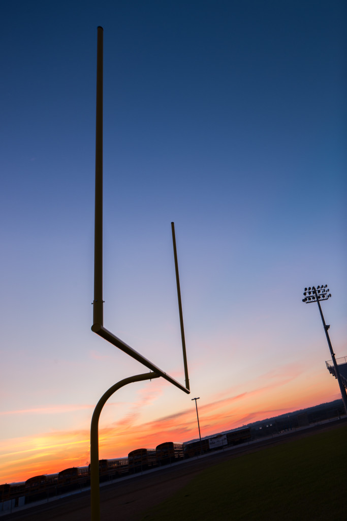
Helena Alabama High School at Sunset
Helena AL High School Feild Goal Post sunset
Shilouette Football Field Goal Post
Helena AL High School  front evening
Helena AL High School front evening
Helena High School Blue Hour Before

View more of my Architectural Photography Portfolio here.

I'm available for commercial, architectural, real estate and Google Maps Business View Photography throughout the Southeastern United States (Alabama, Mississippi, Louisiana, Florida, Tennessee, Georgia, South Carolina, and North Carolina). Have a project in need of photographs? Contact me today!

Daylight vs Blue Hour for Real Estate Photography - An Amazing Difference by nikonic1976@yahoo.com

Recently I photographed a rather large and very expensive home for sale in the upscale Mountain Brook area of Birmingham, Alabama for one of the areas elite real estate agents (full post on the home coming soon). This 8,000+ sq ft home is selling for well over a million dollars. The potential pool of buyers for this home is quite small. To capture their attention you must make your listing stand out in a major way. Having a professional photographer, especially one that specializes in architectural photography such as myself, photograph the home is a major step in that direction (see this post on the differences between professional and amateur  real estate photography). However, as good as it is to have professional photos done, the impact of the photos can be kicked up a notch significantly. Some of you may have heard of the "magic hour" as a photography term. This is the hour before sunrise and before sunset when you get beautiful warm light. Many photographers will tell you that this is the best light and it's when many concentrate their shooting. I'm not disagreeing with this at all. In fact, I too have scheduled many a shoot to fit these times to get amazing light. When it comes to real estate and architectural photography, however, there's a time that's even better. It's called "blue hour" (this is a bit of a misnomer because it's actually about 15-30 minutes tops). This is the time just after the sun has gone down completely. There's a little orange on the horizon but mostly the sky has become a deep, deep blue. This is the time when a building or home, well-lit with artificial lighting can really shine. Using multiple exposures of many seconds to tenths of seconds composite together you can create an image that's stunning and attention grabbing.

The key to this technique is timing. Shoot too early and the lights of the home or building are washed out by the sunlight. Shoot too late and the sky is black and the powerful colors are lost. The window is narrow. You have to be in position and ready to shoot, then move quickly to get the images. Make a mistake and you may not have enough time to get it corrected. Because of this, and because you usually have to go back out after taking the daylight shots, very few photographers use this technique. However, if you want your listing, advertisement, or professional portfolio to really jump off the page or screen, there's really no better way than a blue hour image.

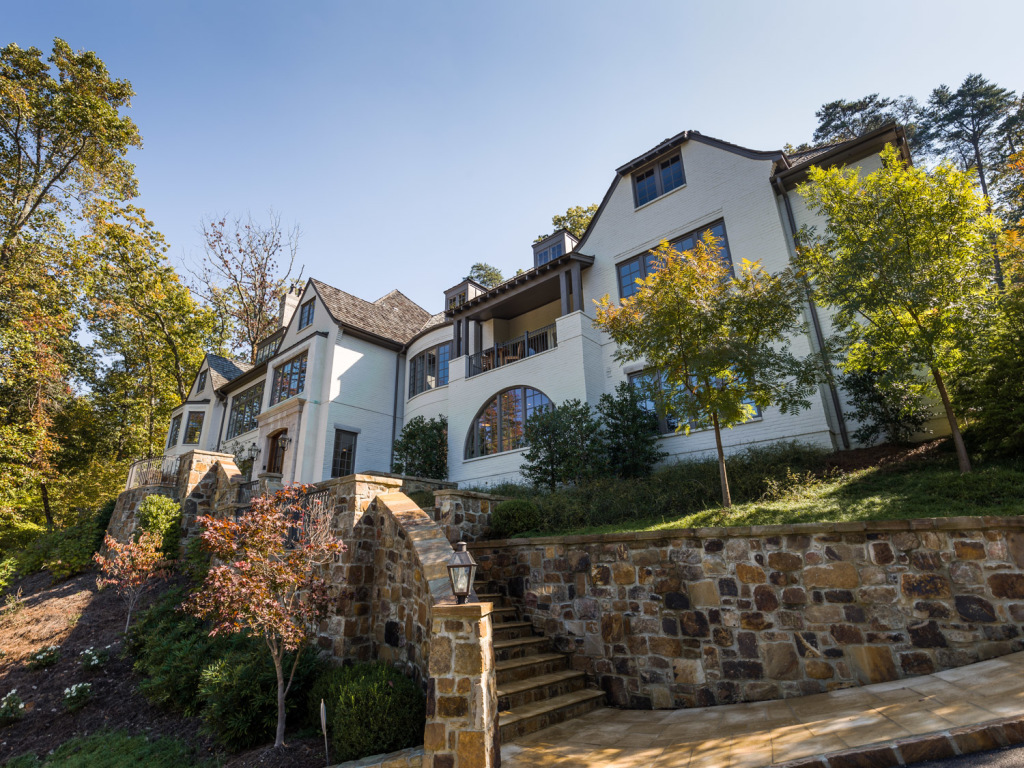
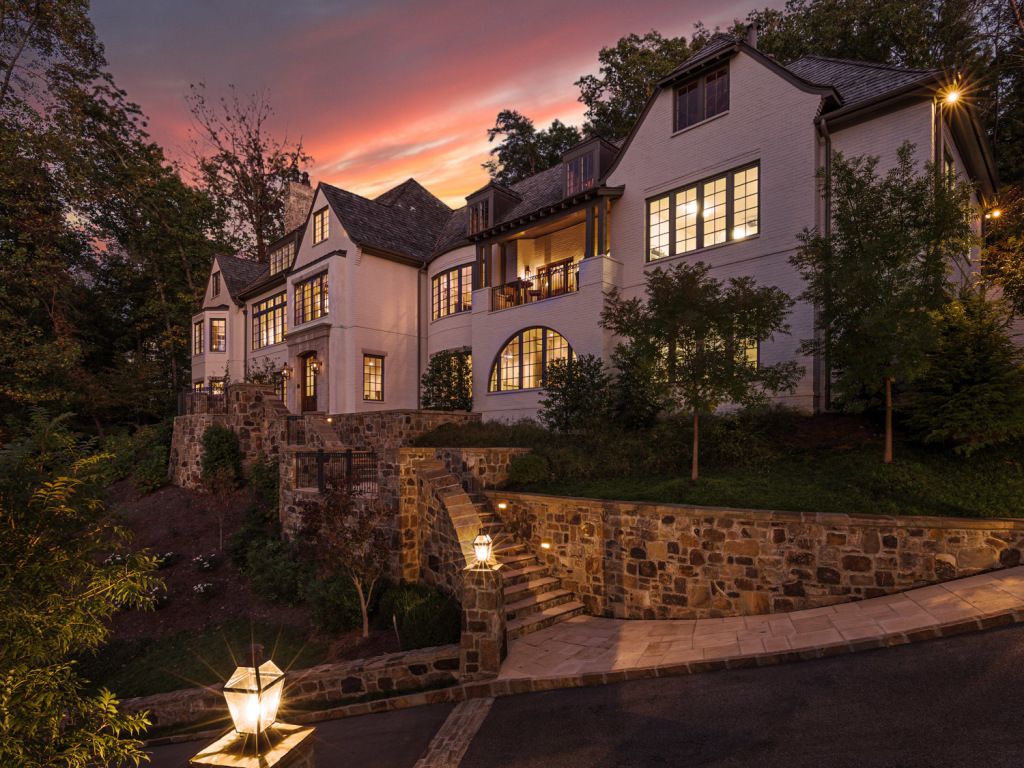
For this house I did the conventional daylight shots and then came back several hours later to do the blue hour shots. Below you can see the conventional images next to the same scene at blue hour. The daylight shots by themselves are ok but when you see the two side by side the difference is striking! One thing that is critical to point out, when it comes to real estate photography, it's very important to accurately represent the property. There are some photographers that will add "up lighting" with strobes. This is fine for illustrative or editorial images (and something that I do), but when selling a property, the addition of lighting could give a buyer a false representation of how the home actually looks. For that reason all the light you see in the images below was actually present in the scene. No lighting was added by me.

click on image to view larger

Daylight shot of the home. Not bad but not too exciting either.

Blue hour image. It's a composite of 7 individual images taken at different exposures to capture the full range of tones present but no additional lighting was added.

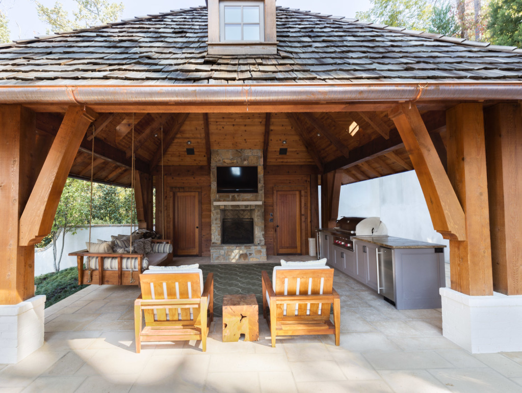
This outdoor pavilion is a great space for entertaining, especially during football season! Again, in the daylight it's not bad, but could be so much better.

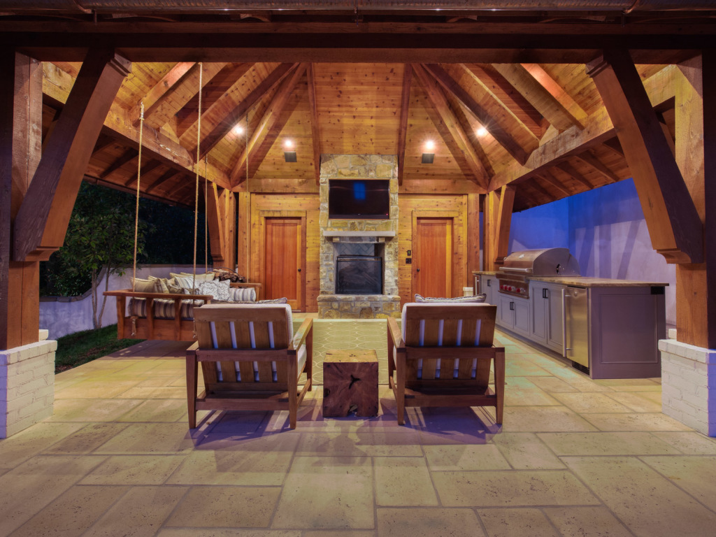
Now, that's better! I know which one I'd rather be in!

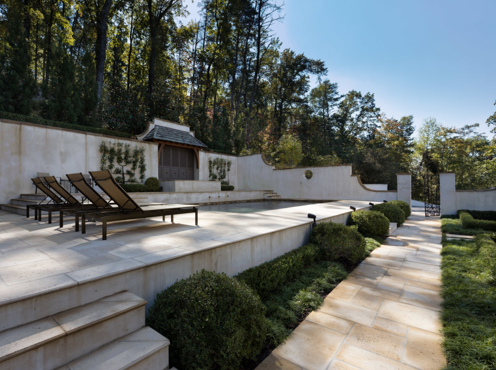
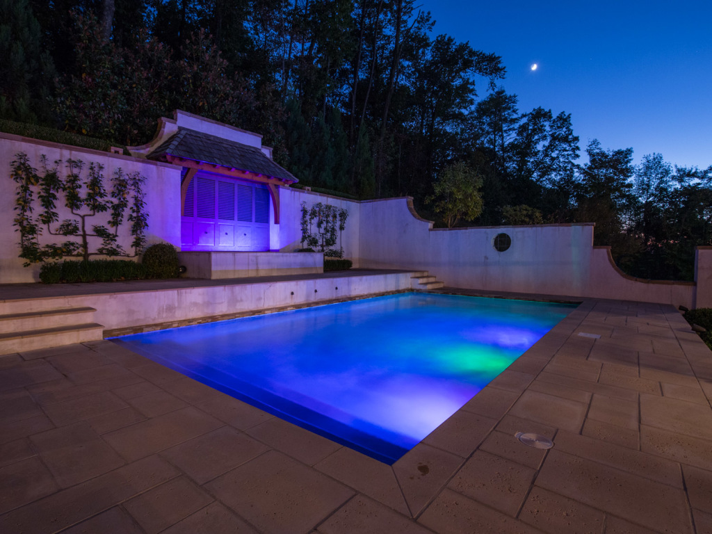
Pool area was beautifully landscaped and quite amazing. The daylight shots don't do it complete justice.

2833 Cherokee Rd - Birmingham Real Estate Photographer0044

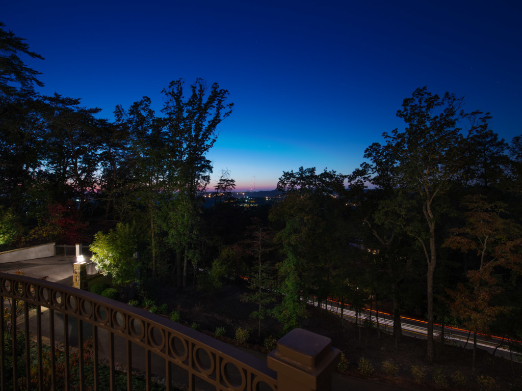
Lastly, this is the view from the front porch of the home. It overlooks the city of Birmingham with a great view. In the daytime the city in the distance would be washed out and not very appealing. The city lights against the deep blue sky really convey an altogether different feeling!